Topics discussed in this article:
•Grid Entry Screen Header, Menu, and Controls
Overview
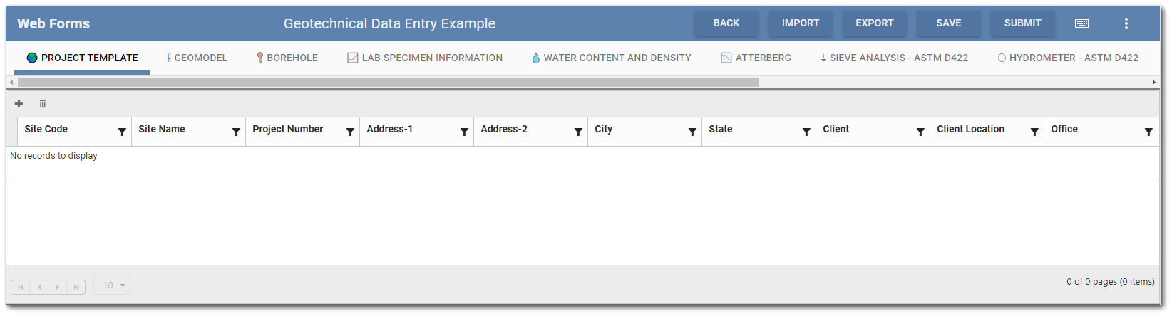
Manual data entry is performed on the Grid Entry screen of the Web Forms widget. The Grid Entry screen can be opened by clicking the Edit  icon or the Create
  icon of a data form in the the Web Forms List. The Web Forms List is replaced with the Web Forms Grid Entry screen. The data entry grid reflects the structure of the Collect template used to create the data form. If the Collect template has multiple forms, then each parent form will be a separate tab in the Grid Entry screen. Each field on the form will be displayed as a column header in the grid.
Note: A data form can only be edited by one user at a time. If a data form is already being edited by another user, the data form will be locked to other users. Multiple users can add/edit content in a data form before it is submitted to Enterprise EDP, just not concurrently. |
|---|
Grid Entry Screen Header, Menu, and Controls
The widget header displays the name of the selected data form. Hovering the mouse over the name shows a tooltip with the name, Collect template, and EQuIS format of the data form. The widget header also contains buttons to perform actions for the Grid Entry screen. The bottom of the Grid Entry screen contains paging controls for displaying the number of records at a time.
Header Buttons
Split View – The split view feature (  ) allows users to view and edit both parent and child forms at the same time. See the Grid Entry Screen Operation section for more details. Administrators can enable split view by default in the Web Forms Settings Manager.
Filter – A Filter drop-down may be present if the Web Forms widget is configured to filter the content of forms and subforms within a Collect template by a single field (e.g., Location). See the Web Forms Filtering article for more details.
Refresh – Selecting the Refresh  button will refresh the widget, similar to refreshing a web page within the browser.
Back – The Back  button returns the user to the Web Forms List.
Save – Selecting the Save  button will save data entered in the data form but does not upload the data to EQuIS Schema tables. All data entered in the data form remains available to be edited. The Web Forms widget is automatically configured to autosave grid entry every 5 minutes (unless changed in the Web Forms Settings Manager). A data form will also automatically be saved when the user navigates from the Grid Data Entry screen or uses the browser forward/back buttons.
Note: If the form contains Unique Data Set entries that are not unique, a warning will indicate which entries need to be changed. In order to not lose data, the form will not save until the duplicate values have been changed. |
Submit – The Submit  button uploads the data form to be checked by Enterprise EDP using the EQuIS format defined in the Collect template upon which the data form is based. Users will be asked to confirm data submittal prior to uploading to EQuIS.
Keyboard – Selecting the keyboard 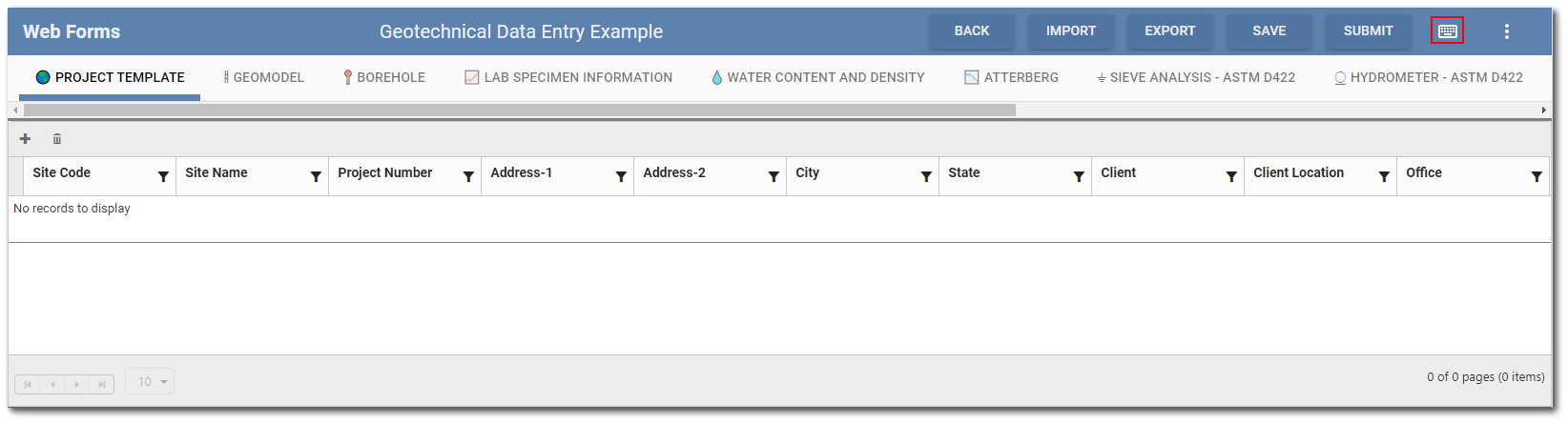 icon will open a menu with keyboard shortcuts. See the Keyboard Shortcut Menu section for more details.
Menu
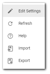
Select the More Options  icon to open a drop-down menu with the following options (based on user permissions):
Edit – Selecting the Edit Settings menu option will open the Widget Editor, which contains settings that control how data forms are displayed and how the data entry grid operates. Refresh – Selecting the Refresh menu option will refresh the widget, similar to refreshing a web page within the browser. Help – Selecting the Help menu option opens the Enterprise documentation in a new tab. Import – Allows users to import data from a Microsoft Excel spreadsheet. To import properly, the spreadsheet must be in the correct layout. The Export menu option can be used to generate the correct layout. When entering data in an Excel file for import into the widget, each row will need to have an ID and parent. The ID must be unique across the entire worksheet. The parent refers to the parent row ID in the parent form. If the row does not need a parent, use ‘-1’.
Export – Allows users to export data to a Microsoft Excel spreadsheet. The exported file contains a separate worksheet for each form (i.e., tab) in the data form and users are able to select which forms are included in the exported data form. Each worksheet contains the columns (i.e., fields) on that form. The default naming convention is "Data Form Name_Facility Code". The following Export options are also provided: •Export the structure of the data form to a blank spreadsheet. •Exclude meta fields and/or hidden fields in an exported data form. Please note, metadata are required to reimport the file back to Web Forms. |
|
If an option is not selected, the More Options menu can be cleared by left-clicking in blank space elsewhere on the Dashboard.
Grid Entry Screen Operation
Collect templates can have parent forms and child forms (sub-forms). Thus, data forms created from the template can have parent forms and child forms. Parent forms and any forms without child forms will display as tabs at the top of the data entry grid.
Selecting a tab in the Grid Entry screen will display the supported fields as column headers in the data entry grid. If child form(s) exist for the selected tab (i.e., parent form), the child forms will display beneath the data entry grid.
Any forms that contain data will have the form name displayed in bold.
Note: If the Background Color attribute has been configured for the Collect Template that was used to create the Web Form, the Background Color will be displayed under same conditions. Please see the Collect Forms – Field Types and Attributes article for more information. |
|---|
Child Forms
If child form(s) exist for the selected tab (i.e., parent form), the child forms will display beneath the data entry grid. Users have the option to view and edit child forms with their parent form in a split view or to view and edit them in a full grid (i.e., split view off).
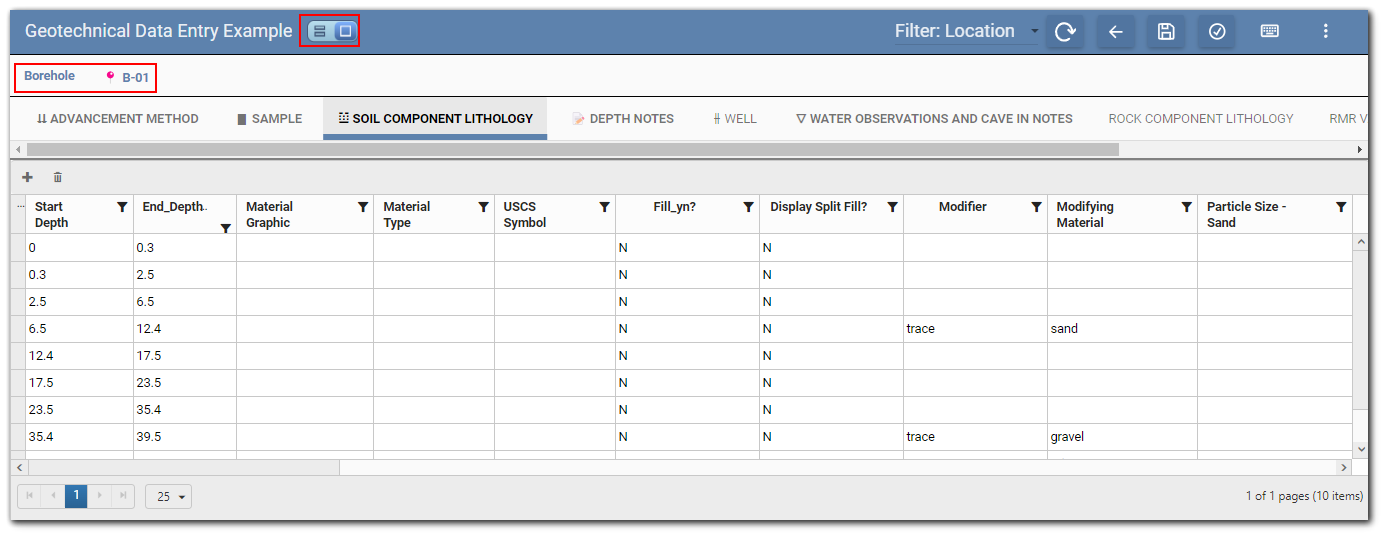
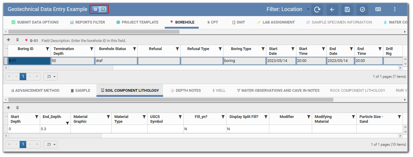
In the example below, nine child forms are associated with the "Borehole" parent form. The Borehole B-01 record is selected on the parent form and the "Soil Component Lithology" tab (i.e., child form) is ready for data entry.
Example – Split View Off
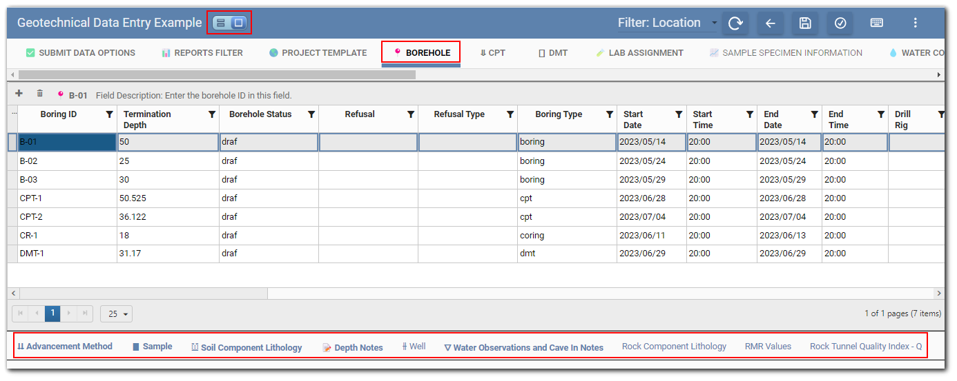
To open a child form, select a row in the parent form grid and then select a child form on the bottom of the Grid Entry screen. The Grid Entry screen will change to display each child form as a tab with the selected row from the parent form denoted above the tab(s). Each child form tab can be accessed after any child form is selected.
Example – Split View On
When toggled on, the split view feature allows users to view and edit both parent and child forms at the same time. To view/edit a child form, select a row in the parent form grid and then select a child form (tab) from the bottom grid.
Only formulas in the parent record will be effected by changes in the child records. If changing child records of one parent record effects formulas of a different parent record, the formulas will not be updated until the form is reloaded.
Supported Field Types
The Web Forms widget supports many field types available in a Collect template. Unsupported field types will be disabled. The following is a list of all supported field types:
•String
•Long String
•Date Time
•Date
•Time
•Integer
•Decimal
•Selector
•Multi-Selector
•Group Selector
•Group Multi-Selector
•Dynamic Selector
•Form Lookup
•Image
•Multi-Image
•File
Data Entry in Grid
Users can add new records (i.e., rows) or edit any existing records in the grid. Select a cell in an existing row to make the cell active for data entry. For the selected row, the value of the form's header field (e.g., location, sample ID) and the field description for the active cell displays in the grid pane above the column headers. Hovering the mouse over any column header will display a tooltip with the field description. When changes have been made on the form, an asterisk will display to the right of the form name until the changes have been saved.
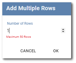
To add new row(s) to the data entry grid, click the Add  icon in the upper left corner of the grid. The Add Multiple Rows dialog will open. Enter the number of desired rows and click OK. A maximum of 50 rows can be added.
Users can also add a row while actively entering data. Press the Enter key when in a cell in the last row to add a single row. The Add Multiple Rows dialog will not open.
Click the Delete  icon to delete the selected records (i.e., rows) from the data form. A message dialog will request confirmation to delete the selected rows. A warning message will be displayed if deleting a record will impact any child record(s) or existing related record(s).
Note: The logic directing how records referenced via Form Lookup fields are handled when a related record is deleted is configured in the Related Records setting in the Collect Enterprise Template Designer. The options are: •Cascade Delete •Remove Reference Only •Delete Prohibited (default value) When multiple forms have the same Related Records setting assigned, then a detailed error message is displayed upon Delete. The detailed error message provides a summary of the records in other forms that will be impacted. Additional information about Related Records is available in the Add Forms to Collect Templates article. |
|---|
The Web Forms widget was designed to support keyboard data entry. Use the "Tab" key to move between cells for quick data entry. Cells containing formulas (i.e., calculated fields) will be skipped when using keyboard navigation. Hit the "Enter" key to save the record and start a new record. See the Keyboard Shortcut Menu section of this article for more helpful keyboard shortcuts.
Note: If the visibility or calculated value of a field is dependent upon the value of another field, the user must actively save the record to activate the calculation/code of the dependent field. |
|---|
Selector Fields
Reference values and other lookup information can be populated using selector field options. For fields that have selector options, values can be obtained using either a drop-down list or a dialog. By default, the multi-selector fields will use the dialog while the single selector fields will use the drop-down. The default display mechanism can be changed in the Web Forms Settings Manager. The only exception to this is when a dynamic selector field allows for user values—the field will always use the dialog. When a user selects the options drop-down or dialog, both the field Code and Description will be displayed. Once an option is selected and the cell is no longer active, only the field Code will display in the cell.
Note: The sort order of selector field options is defined by the properties of template fields "Sort" and "By", described here. |
|---|
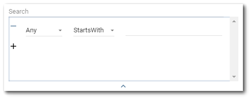
The selector dialog has a search that can expand into an advanced search to find items more easily in long lists.
Advanced Search – Click the down arrow to expand the advanced search dialog window. Items that can be searched will appear in the first drop-down. By default, the first drop-down will be selected as Any. The Any option will search all the items to match the expression with any of the properties. The second drop-down allows the user to select an operator (e.g., Starts With, Ends With, Equals, Contains). By default, the operator is set to StartsWith. The operator defines how the expression is matched to the items being searched. Enter the expression to be searched in the text field. Multiple expressions can be set by clicking the + button below the first expression. Expressions can also be removed/cleared by clicking the – button to the left of each expression. To collapse the advanced search dialog, click the up arrow at the bottom of the advanced search dialog. Note that collapsing the advanced search will not clear search expressions that have been setup.
When the field is a dynamic selector field and allows user values, the dialog will have code and description input fields for adding a custom option. The order and visibility of these input fields depends on the display format of the field.
Note: Each custom option for a dynamic selector field must have a unique code value. If an option with the same code value already exists, the custom option will not be used. |
|---|
Image and File Fields
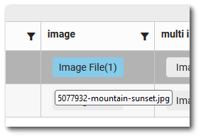
Files, including images, are added to data form records using image, multi-image, and file fields. A button will be displayed in these fields that users can select to open the file dialog to add files to the data form.

At the bottom of the file dialog is a button for adding files. If the field type is file or multi-image, users will be able to add multiple files. After adding a file or image, a section in the dialog contains a thumbnail for the file, the file name, and two buttons—one for deleting the file and one for downloading the file.
The file/image field buttons display the number of files added to the field. The file names are displayed in a tooltip when a user hovers the mouse over the button.
Note: Only file types listed in the RT_FILE_TYPE table can be added in the file dialog. |
|---|
Keyboard Shortcut Menu
Clicking the Keyboard icon on the widget header will open a menu with keyboard shortcuts.
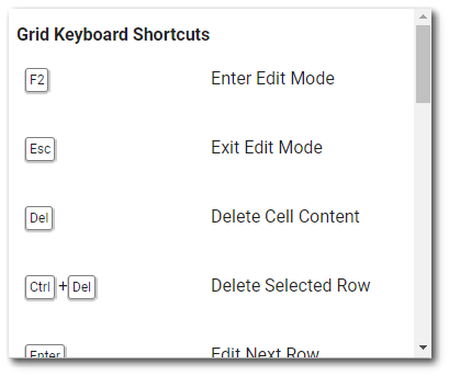
The Grid Keyboard shortcuts are also listed below.
F2 – Enter edit mode
Esc – Exit edit mode
Delete – Delete cell content
Ctrl + Delete – Delete selected row
Enter – Edit next row
Tab – Edit next cell
Shift + Tab – Edit previous cell
Ctrl + S – Save
Ctrl + C – Copy cell content
Ctrl + V – Paste cell content
Ctrl + Alt + C – Copy selected row
Ctrl + Alt + V – Paste copied row
Alt + C – Copy selected row and its children
Alt + V – Paste copied row and its children
The Drop-down Keyboard shortcuts are also listed below.
F2 – Open drop-down
Arrow Down – Move cursor down
Arrow Up – Move cursor up
Shift + Arrow Down – Select while moving cursor
Shift + Arrow Up – Select while moving cursor
Space – Multi-select: Select item at cursor
Delete – Clear all selections