Once a field is added to a form, field properties and attributes can be assigned. The role and nature of the respective field is designed by defining field properties and applying field attributes.
When changed from the default properties, any attribute assigned to a field is displayed in blue on the field in the Form Setup page. Hovering the mouse over the attribute button will display the associated formula. The attribute button can be clicked to open the formula editor for that attribute.

If data mappings have been applied to the field, a "Mapped" blue button is displayed with the number of data mappings in parentheses. Clicking the Mapped button will open the Mapping Grid window to view or download the existing data mappings.

Field Types
The following table provides a brief description for available field types based on the type of data used in the field. The field type icon is displayed on the field (in the Form Setup page) to the left of the field name and caption.
Data Type |
Field Type |
Icon |
Description |
Text |
|
Characters and letters (255 character maximum). |
|
|
Large number of characters and letters (4000 character maximum). |
||
Time* |
Date |
|
Date picker displayed in app; full date/time recorded. |
DateTime |
|
Date and time displayed in app and recorded. |
|
Time |
|
Time picker displayed in app; full date/time recorded. |
|
Timer |
|
Record a time duration. |
|
Number |
Integer |
|
Whole number. |
Decimal |
|
Fraction whose numerator is expressed by figures placed to the right of a decimal point. |
|
Counter |
|
Use buttons to increase or decrease the value. Uses whole number increments unless otherwise defined in the Increment attribute. Keeps values within a range set in the Minimum and Maximum field attributes. Default minimum is 0 and default maximum is 10. |
|
Range |
|
Use a slider control to choose a value, in increments of 0.1, between a range set in the Minimum and Maximum field attributes. Default minimum is 0 and default maximum is 10. |
|
Image |
Image |
|
One image file; supported with the EDGE format and the Collect Inspection format. |
MultiImage |
|
Multiple image files; supported with the EDGE format and the Collect Inspection format. |
|
Drawing |
Drawing |
|
Make drawings, text boxes; can select a background image to help annotate photos. Saves as an SVG. |
|
Sign a form; once signed, the form is locked and will only be editable after clearing the signature. |
||
Sound |
Sound |
|
Record audio. |
|
Capture coordinates via GPS or manual location on a map; can be used to geo-locate a form (see Map Setup on Collect Forms and Collect Mobile Map Form Viewer). Collect Mobile, by default, will use the highest accuracy setting possible from the device for capturing coordinates (GPS) and users should not change that setting. |
||
|
Plot points, lines, and polygons in Collect Mobile. |
||
|
Static drop-down list where one value is selected (similar to an enumeration in EDGE). |
||
|
Static drop-down list where multiple values can be selected (similar to an enumeration in EDGE). |
||
|
Single select list with options organized into groups. |
||
|
Multi-select list with options organized into groups. |
||
|
List of values produced by a JSON array. |
||
|
Logic True or False. |
||
Other |
|
Field designed to obtain data from other forms within the same form template. Provided as a lookup to select another form within the template. |
|
Formula |
|
Performs a formula designed with Collect functions. See Formula Builder in Collect and related articles. |
|
|
Enables data to be pulled from internet using API sources (e.g., weather data URL, EQuIS Enterprise URL to run Collect API reports). |
||
Engineering |
|
Engineering value is numeric and has a drop-down for unit. In Options, add unit values to be associated with user’s input of numerical values. Recorded data is stored as a JSON with "Number" and "Unit" elements. The JSON function can extract the number or unit. |
|
Plane Orientation |
|
This value has two decimal fields Strike and Dip using right hand rule. |
|
|
Used to extend navigation (similar to a hyperlink). |
||
|
Allows filtering of only specific file type extensions to be attached to the template. |
||
|
Allows direct data entry in a tabular format on Collect Mobile. |
* Collect Mobile stores date/time values in the FormsData.xml (raw data file) in an international date format with a UTC offset stamp. Collect Mobile uses the device’s Regional settings to translate the stored date/time value into the corrected date/time value displayed in the app. When mapping to an EDD, Collect uses the date and offset stored in the FormsData.xml to translate the local date/time value into the EDD. See Culture Setting Conflicts in EDP for additional information on common Time field conflicts in EDP using an EDD generated from EQuIS Collect.
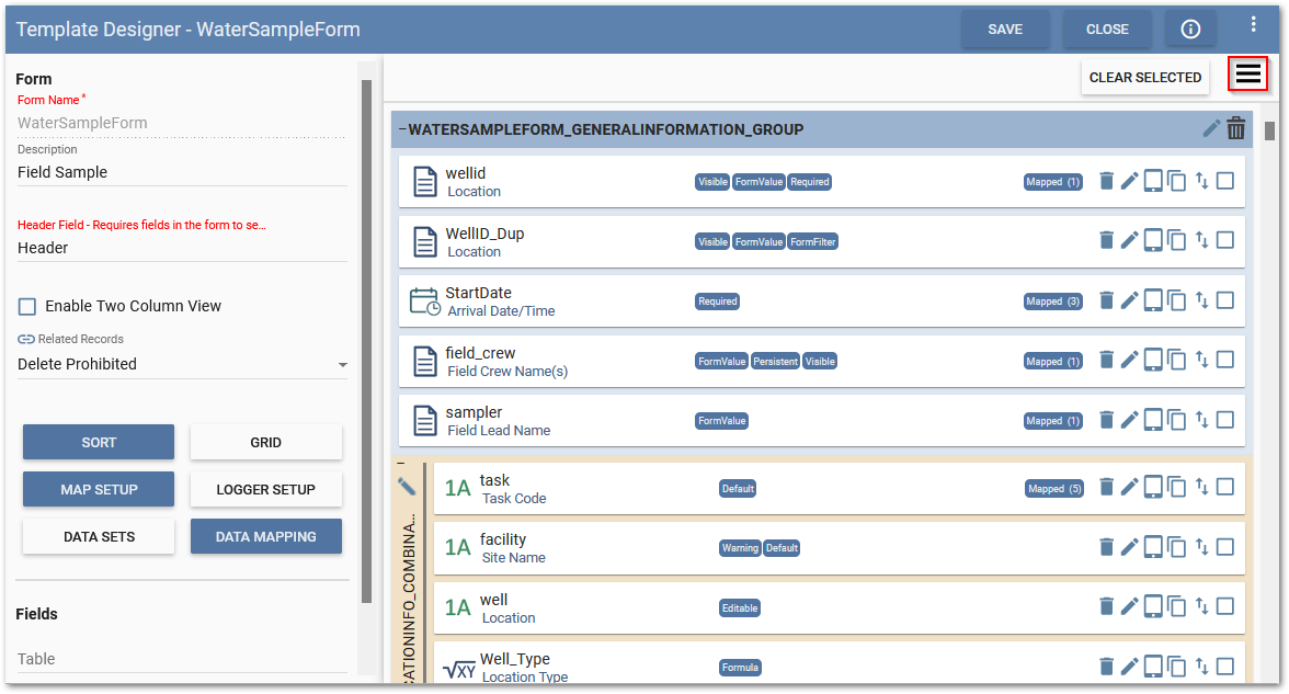
Editing Individual Field Properties and Attributes
To access field properties and attributes, identify the field to edit and click the Edit  icon.
icon.

The Edit Field page opens. Edit the field attributes as desired. If the field attribute being changed is also existent in other parts of the template (mapping, pre-population, select/multiselect, etc.), a warning message will be displayed to advise the user. The warning message does not prevent the change and is intended to inform the user of the possible consequences of performing the change.
Editing Multiple Field Properties and Attributes
To edit multiple field properties and attributes at once, click the Attributes  button.
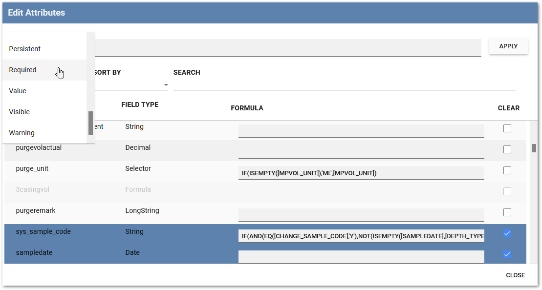
Selecting the Edit Attributes option opens a dialog for all of the fields in the current form. In addition to the fields, each field's type, existing formulas associated with each field, and check boxes for selecting the fields to modify are shown.
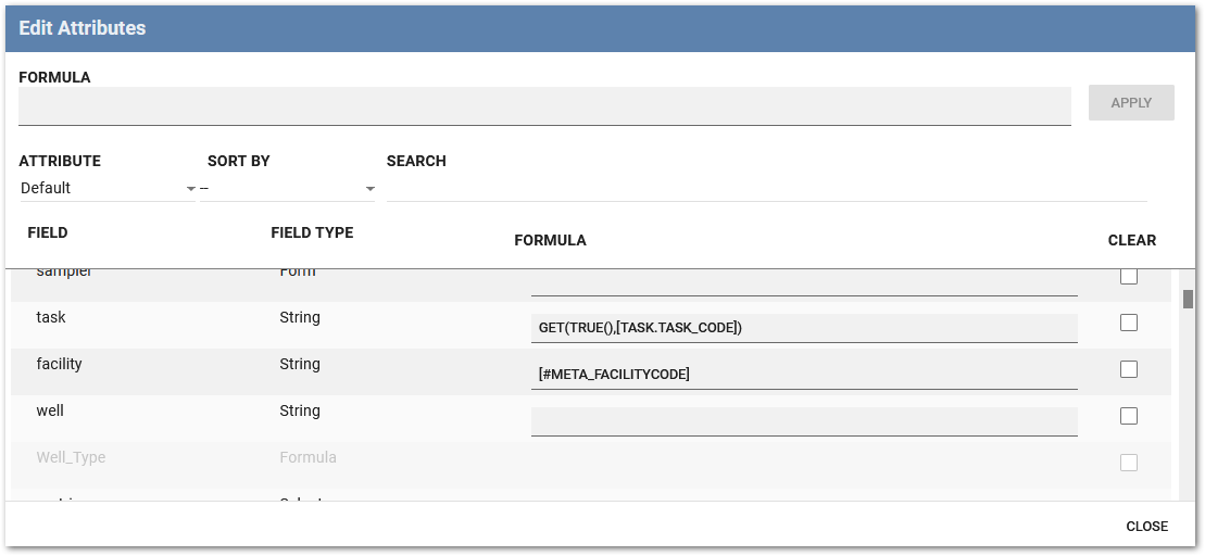
Users are able to select one or more fields using the check boxes on the right side of the dialog. The Attribute dropdown list includes all of the available attributes, sorted alphabetically, for the selected field(s). Double clicking on the formula of an attribute will copy the formula to the main formula input box at the top of the dialog. Pressing Apply will populate the attribute's formula for the selected field(s) with the value showing in the main formula input box.
Note: The Edit Attributes dialog includes all fields including fields that can not be edited. Fields which are unable to be edited are displayed in light gray text and are not selectable. |
|---|
It is possible to sort by the fields using the following methods:
•Has Attribute sorts the fields that are able to have an attribute are listed first (default value);
•Has Formula sorts the fields that currently have a formula value are listed first;
•Name sorts the fields are listed in alphabetical order;
•Selected sorts the fields that are currently selected are displayed first;
•Type sorts the fields are listed alphabetically by type;
•– (i.e., hyphen character) indicates that no sorting will be used;
The Search bar allows users to enter text and search for specific fields based on the field name or type. Clicking on the Formula text box at the top of the dialog opens the Formula Builder for applying a formula to the selected field(s). Clicking Apply to the right of the Formula text box will result in a warning message that notifies users about the currently selected fields and that any existing attributes will be overwritten with the formula, including clearing out any existing attribute(s) if no formula is present, if they continue. Clicking Close results in all selected fields being unselected and the dialog is closed.
Field Attributes
The field attribute options vary depending on the field type assigned, but the caption and description will always be available.
Caption – Although a caption is not required, providing a clear and concise caption is recommended as the caption will be displayed on the mobile device rather than the field name. If no caption is given, then the field name will be displayed instead. This field remains editable.
Description – Provides details about the nature/content of the field.
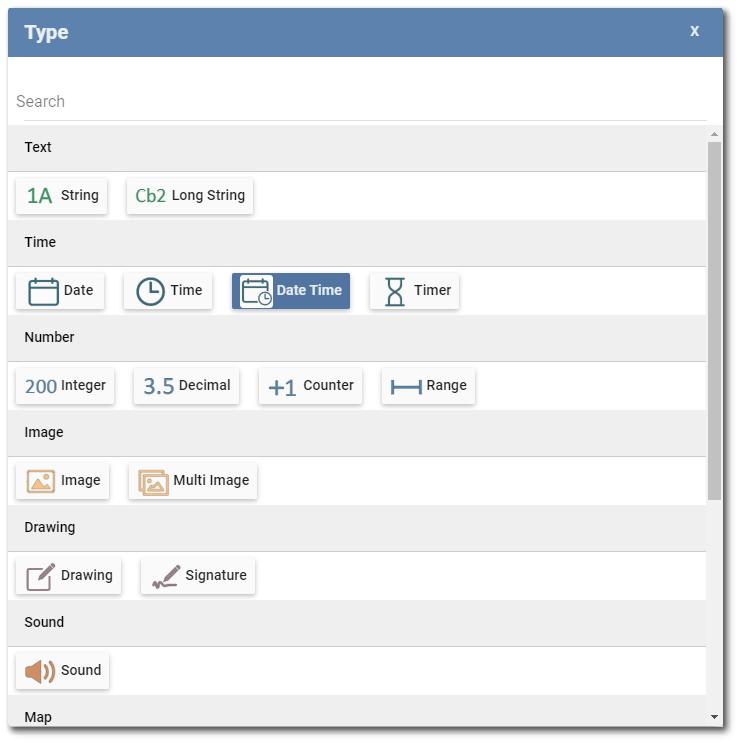
Type – Define the field type, which depends on the type of data to be captured. To assign or change a field type, click in the Type text box to open the Type dialog window. Find and select the desired field type. The currently assigned field type is displayed in blue.
The Selector, MultiSelector, Group Selector, Group MultiSelector, Dynamic Selector, Form, Service, Engineering, and Action field types have specific setup requirements. If these fields are missing information that would cause errors on the Mobile app, a warning message will be provided when trying the save edits to these fields.
Once the field type is selected, other options may be displayed. The following images and definitions show a few of the various field type options.
Mask – The mask feature permits string fields to be additionally defined by the type (masking element) and number of characters allowed. More details on the use of masks are available here. This attribute option is displayed only when the field type is a string.
Keyboard – Determines whether an alphanumeric or number pad keyboard should be presented when entering data in the field.
Note: String field types include the following keyboard options: Default, Numeric, Email, Telephone, or Chat to simplify data entry based on the type of information being gathered. |
|---|
Maximum Length – Defines the maximum field length. String field type can have maximum length between 1–255 whereas Long String field type can have maximum length between 1–4000. If a user tries to enter a value beyond the maximum length, an error message will display and prevent the field from being saved.
Logger Field – Any field of type string, long string, decimal, integer, plane orientation, or engineering will include a Logger Field property. The Logger Field is used to set up a data logger for the device. Selecting the field will open a dialogue and allow a user to select a logger parameter for the field.
Purpose – Optional text area for describing the intended purpose of the field, such as a hidden field. The Purpose field is only displayed when in edit mode in the Template Designer. By default, placeholder text is displayed to prompt the user and can be overwritten.
Show Historical – By checking the Show Historical box, this option will be enabled in the application on the mobile device. A list of historical values will be displayed below the respective field.
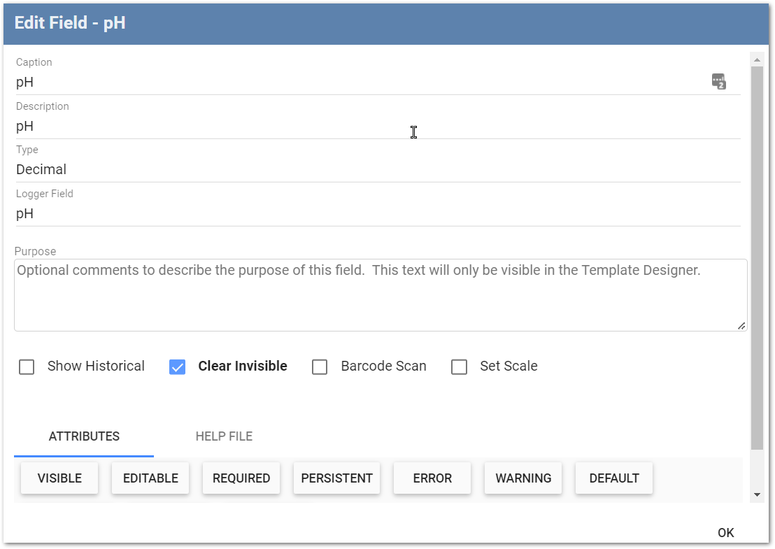
Clear Invisible – The Clear Invisible attribute is used to determine whether a value in a field with the VISIBLE attribute set to FALSE is preserved or cleared when the form record is saved (i.e., the field is not visible on the form in Collect Mobile). When the Clear Invisible box is unchecked, the value is not cleared when the record is saved. When the Clear Invisible box is checked, the value is cleared when the record is saved. The Clear Invisible attribute is useful for preserving or clearing prepopulated, non-visible field values, depending on if the prepopulated value is still relevant when a record is saved. Clear Invisible is unchecked by default.
Scenario |
Results |
|---|---|
The Clear Invisible attribute is unchecked and the field's Visible attribute is set to FALSE. |
When the record is saved, the value of the field will not be cleared. |
The Clear Invisible attribute is checked and the field's Visible attribute is set to FALSE. |
When the record is saved, the value of the field will be cleared. |
The Clear Invisible attribute is checked and the field's Visible attribute is set to TRUE. |
Since the field's Visible attribute is set to TRUE, the Clear Invisible attribute will not be triggered. |
The Clear Invisible attribute is checked and the field's Visible attribute toggles between TRUE and FALSE depending on a set logic. |
If the field's Visible attribute evaluates to TRUE, the value of the field will not be cleared when the record is saved. If the field's Visible attribute evaluates to FALSE, the value of the field will be cleared when the record is saved. |
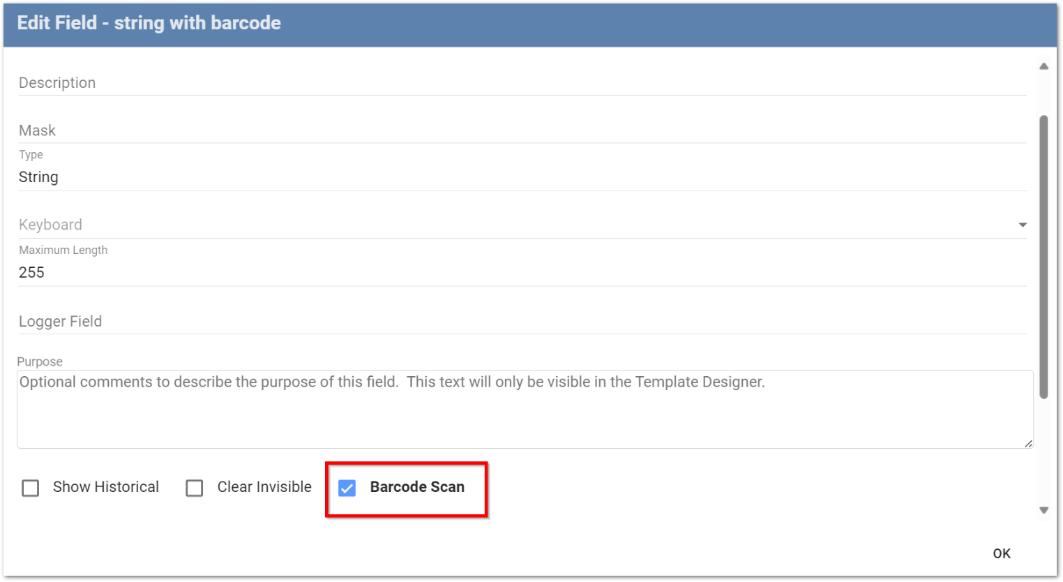
Barcode Scan – By checking Barcode Scan, a button will appear in Collect Mobile that enables a 1D barcode or 2D QR code to be scanned using the device's onboard camera. The scanned string is written into the field. Collect supports scanning a QR code and the one-to-one mapping of the QR code text to the marked field.
Resize – For image and drawing field types, the maximum size of the image file can be set. This feature aims at reducing file size and server space. If the images are smaller than the dimensions of the assigned size option, they are not resized. If the images are larger than the dimensions of the assigned size option, they are resized based on the maximum measurements allowed. Four options are available from the drop-down:
•Small – Maximum size of 816 x 612 pixels
•Medium – Maximum size of 1632 x 1224 pixels
•Large – Maximum size of 2448 x 1836 pixels
•Original – Keeps both the file size and picture quality of the original image
The Drawing field type defaults the Original file size option to the Large file size option to improve Mobile app performance.
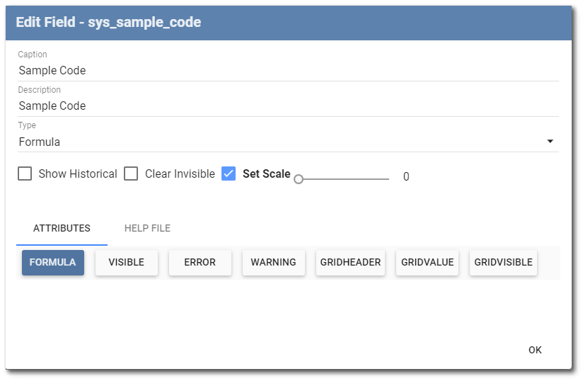
Set Scale – Scale is a rounding feature for decimal places and applies to Decimal, Formula, Engineering, and Plane Orientation field types. This feature is especially important for the Formula data type to ensure that a field does not calculate an infinite digit, decimal count.
Attributes Tab
Field Attributes are formula defined values that control the way fields behave. Different attribute buttons will be displayed for different field types. Any attribute will display as blue when changed from the default properties. When hovering the mouse over an attribute button, a tool-tip will display the definition of the specific attribute. If designated, the attribute value or formula will appear in blue in the message section of the Edit Field page (below the Attribute tab).

Within the Attributes tab, select each attribute type to define its formula. A description of how each attribute affects the functionality of the field is provided below.
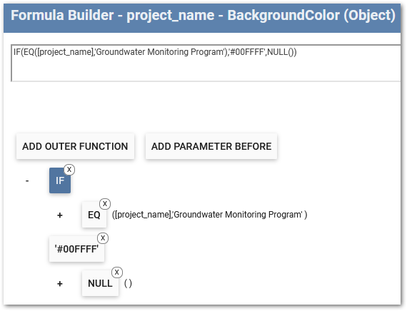
Background Color – Defines the hexidecimal value to configure a custom color for the background of any field type (i.e., setting the background color to #32A846 will result in the following green color:  ). The Background Color value can be set using the Value tab, or using a formula, within the Formula Builder.
Caption Color – Defines the hexidecimal value to configure a custom color for the caption of any field type (i.e., setting the title color to #FF0505 will result in the following red font:  ). The Caption Color value can be set using the Value tab, or using a formula, within the Formula Builder.
Default – Object definition (value supplied by Default will be converted to the same Type as the field; e.g., Decimal, Integer, String, etc.) Logic set in this attribute decides what default value, if any, should be assigned to this field when no value is otherwise provided (e.g., when a form record is first created). The attribute applies only when this field is visible on the form. The Persistent attribute is applied before Default; therefore, if persistence is true and a value was entered in a previous record, then the previous value will be used instead of the default. The Default attribute is not dynamic. Therefore, the “Reset to Default value” must be applied to update Default Formula values with dependencies from other fields in the form.
Editable – Boolean definition. Logic set in this attribute decides whether this field is editable on the form. The TRUE option is set by default. Consequently, the field will be editable on the mobile device if unaltered. If marked as FALSE, the field will be skipped for data entry. Setting the Editable attribute to FALSE is recommended for fields that contain formulas.
Error – Boolean or string definition. Logic set in this attribute determines under what conditions the field value is invalid. If the value is FALSE or an empty string, there is no error message shown. If the condition is TRUE, then the field is highlighted, and a string is displayed as a message if configured. If an error is returned, the user is unable to save the record in Collect Mobile until the error is resolved.
String Definition Example:
The IF function should be used to ensure the logic can return a string value depending on the outcome of the Boolean condition.
IF(EQ([FieldA],[FieldB]),’Error Message’,FALSE())
Where EQ([FieldA],[FieldB]) is the boolean condition determining if an error is returned, ‘Error Message’ is in the TRUE() parameter of the IF statement and therefore returns an error and the message “Error Message”, and FALSE() returns no error. |
|---|
Formula – Logic set in this attribute returns the value defined by a specified formula. The Formula attribute is triggered after any action is taken upon the form record that the Formula field resides in, or after any action is taken for a field that the Formula field is dependent upon. If a new output is available when the Formula attribute is triggered, the value will update. The list of actions that trigger the Formula attribute to reevaluate are:
•The creation of a pre-populated form record during data form creation.
•The creation of a new form record using the "New" button.
•When an existing form record is opened.
•When a field is filled out or updated in the same form record and the user moves out of focus on the field.
•When changes are made and saved to a field the Formula attribute is dependent on in another form record.
•When the form record is saved.
•During Data Sync when one user merges their data from with another user.
FormFilter – Boolean definition. Logic set in this attribute decides whether the form should be available in the form drop-down menu.
FormValue – For any form with the FormFilter value set to TRUE, FormValue is the string value displayed in the form drop-down menu. By default, a form lookup field type will show a selection list of forms using the target form's Header field as the text to select. This attribute overrides the default and changes the way in which the items in the selection list are displayed.
GridHeader – If the field will be displayed in Grid View, used to assign the field as a grid header and how the value will be displayed. The default value is NULL.
GridValue – If the field will be displayed in Grid View, used to assign how the field value will be displayed. The default value is NULL.
GridVisible – Boolean definition. Logic set in this attribute decides whether the field is visible in the Grid view on the mobile device. The TRUE option is set by default.
Minimum – Defines the minimum decimal or string value the start or end of a data set can hold.
Maximum – Defines the maximum decimal or string value the start or end of a data set can hold.
Persistent – Boolean definition. Logic set in this attribute decides whether this field is persistent; meaning, a value entered in this field will be used as the default value in the next form record created. The default value for this attribute is FALSE. The Persistent attribute does not apply to records populated via pre-population.
Required – Boolean definition. Logic set in this attribute decides whether this field requires a value to be entered before the user can continue completing the form.
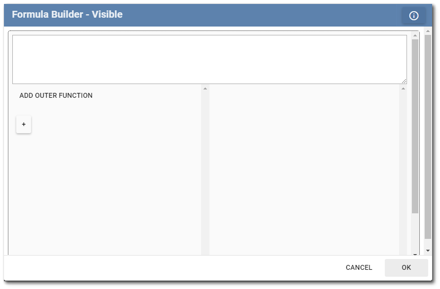
Visible – Boolean definition. Logic set in this attribute decides whether this field is visible on the form. The TRUE option is set by default. Consequently, the field will be visible on the mobile device if unaltered. When the visible attribute is given a NULL value, it will return to the default value of TRUE.
Warning – Boolean or string definition. Logic set in this attribute decides under what conditions a warning will be displayed to the user. If the value is FALSE or an empty string, then no warning is shown. If the value is TRUE or has a string, then the field is highlighted and string is displayed as a message if configured.
String Definition Example:
The IF function should be used to ensure the logic can return a string value depending on the outcome of the Boolean condition.
IF(EQ([FieldA],[FieldB]),’Warning Message’,FALSE())
Where EQ([FieldA],[FieldB]) is the boolean condition determining if a warning is returned, ‘Warning Message’ is in the TRUE() parameter of the IF statement and therefore returns a warning and the message “Warning Message”, and FALSE() returns no warning. |
|---|
Configuring Background Color and Caption Color attributes
The Background Color and Caption Color attributes are configured for individual fields when configuring a template. Selecting either attribute will open the Formula Builder, allowing users to configure colors in one of two methods.
1.Configure the color by setting a hexidecimal value, starting with #, using the Value tab.
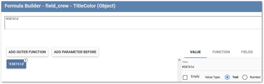
2.Configure a formula to only change the Background Color or Caption Color when certain criteria are met.
The results of the two methods above change the Background Color and Caption Color attributes are shown in Collect Mobile below:
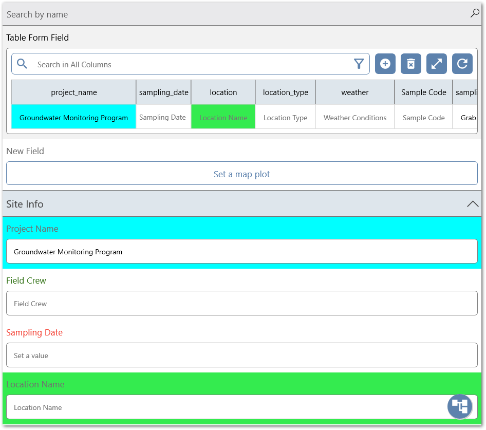
Notes: The following information and considerations should be taken into account when using the Background Color and Caption Color attributes: •Fields that have had colors added, even as part of a formula, will display with a light gray background and black text when selected. The field will revert back to the hard coded or formula-based color scheme once the field is no longer selected. •The Table Form field type differs from other field types in that the Caption Color will only be displayed within a Table Form record. •Do not make the Caption Color and the Background Color too similar. There should be contrast between the colors to ensure the text is readable. For the Table Form field type, it is recommended to use a lighter color for the Background Color attribute since the Table Form values will be displayed with black text. •The Required and Error attributes appear in red text and the Warning attribute appears in yellow text. Since these attributes can include formulas that can hide or show text, it is important to not set a Background Color attribute that is too close to being the same, causing the text to not be difficult to read. |
|---|
Formula Builder
When any of the attribute buttons are selected, the Formula Builder is launched to allow the definition of the function governing the respective attribute value. For all attributes with a Boolean selection, the True option is set by default. The Formula Builder is enabled for editing by clicking on the + button to add a formula component.
A detailed discussion of the Formula Builder is provided here.
HelpFile Tab
For each field on the form, a file can be attached that provides additional information to help the user on the Collect Mobile app discern how to populate the field on the form (i.e., a help file). Select the HelpFile tab to display the options for help files on the app. Only one help file can be added per field. Embedded help files are displayed immediately when the field is opened on Collect Mobile. Non-embedded help files will add a Help feature on the mobile device to open the associated help file. On Windows, help is displayed as a Question Mark icon. On Android and iOS, help is displayed as a HELP button.
Create Sub-Tab
Use the Create tab to add a message to the field. Type the desired information into the box. Select whether or not the file should be embedded. Click the Create button to create a file and attach it to the field. A PDF file will be created using the field name as the document title.

Upload Sub-Tab
Select the Choose File button to display an Open File window. Browse to and select the desired file to attach to the field as help. Select whether or not the file should be embedded. Click the Upload button to attach the file to the field.

Download/Delete Sub-Tab
Once a file has been attached to a field, the Download/Delete tab will be visible. Select the Delete  icon to delete an existing help file. An existing help file can also be downloaded.
