The Widget Editor contains settings that control how data forms are displayed and how the data entry grid operates in the Web Forms widget. Open the Widget Editor by selecting the More Options  icon in the upper right corner of the widget to display the drop-down menu and then select the Edit Settings menu option.
Widget Title – By default, the widget title is Web Forms List. The title can be modified.
Widget Description – The description field provides a caption of the widget content for screen readers. This field improves accessibility by allowing visual elements such as charts to be given accessible text descriptions. It also displays a tooltip when hovering on the widget header. Default text (of the widget type's description) is provided but can be edited by users for additional context. This field has a 250-character limit.
Widget Color – The color of the widget is consistent with EQuIS Collect and cannot be changed using the Widget Theme icon.
icon.
Widget Object Editor – To set various appearance properties of the widget, select the Object Editor  icon in the widget header to open the Widget Object Editor. See the Widget Editor article for more details.
Help – The Help  icon connects to the online documentation.
Copy Settings – Select the Copy Settings  icon to to copy the settings from another widget of the same type. See the Copy Widget Settings article for more information.
Cancel – Select the Close without Saving  icon to exit the Widget Editor without saving changes.
Save – Changes will be applied to the widget by clicking on the Save  icon. The Widget Editor screen will close after the save operation is complete.
Note: If the Widget Editor is opened from the Grid Entry Screen and the widget settings are saved, the user is returned to the Web Forms List and will need to open the data form again to continue data entry. |
|---|
Widget Settings
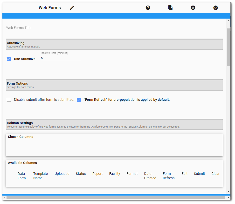
Autosaving
Autosaving will save the data form currently being edited after a set interval. The autosaving option is enabled by default and set to 5 minutes. Users can adjust this setting by changing the inactive time or unchecking the Use Autosave box. The inactive time is in minutes and cannot be less than 1 minute.
Form Options
Disable submit after form is submitted – By default, the Submit button is always enabled, even after the data form has been submitted. Selecting the "Disable submit after form is submitted" checkbox enables administrators to disable the Submit button after a user submits a data form.
"Form Refresh" for pre-population is applied by default – The Form Refresh feature will refresh a pre-populated data form with the latest data from the database. If the '"Form Refresh" for pre-population is applied by default' checkbox is selected, then data forms created using a Collect template that has both a pre-population report and a user report will automatically have the "Allow Form Refresh" checkbox enabled on the data form. However, if the template only has a pre-population report (and NO user report), the "Form Refresh" checkbox is visible but will be unchecked and will not be usable.
Forms open in "Split View" mode by default – The form split view feature (  ) allows users to view and edit both parent and child forms at the same time. Administrators can select this option to have the split view feature enabled by default. Users can still toggle off.
Column Settings
The column settings section allows customization of the columns in the Web Forms List. Users can define which columns are displayed and in which order. By default, the the Web Forms List consists of 11 columns in this order: Data Form, Template Name, Format, Date, Facility, Uploaded, Status, Reports, Edit, Submit, and Clear. The "Available Columns" pane shows these available columns for the Web Forms List. In addition, the Form Refresh button is available.
The "Shown Columns" pane indicates which of the columns will be displayed and in which order. If the "Shown Columns" pane is empty, the Web Forms List will default to showing all columns in the default order. To add a column to the "Shown Columns" pane, drag the item from the "Available Columns" pane. Change the column order by dragging the columns to the desired positions. To remove a column from the "Shown Columns" pane, drag the item to the "Available Columns" pane.
Note: If "Submit" is not included in the Shown Columns section, the Submit button will not display on the header of the Grid Entry screen as well as not displaying in the Web Forms List. |
|---|
Shown Templates
The Shown Templates section allows filtering by template of the data forms displayed on the Web Forms List. By default, all data forms associated with the currently selected facility and have a user group that includes the current user will display on the Web Forms List. Selecting templates from the list in this section will filter the list to display only data forms that use any of the selected templates. Click on the button representing a template to select it. Click on the button again to unselect it.
Administrators can also limit which templates are displayed in the Data Forms dialog when creating new data forms by checking the Filter the templates list when creating data forms box and then selecting the template(s) that will be displayed in the dialog.
Selection Dialog
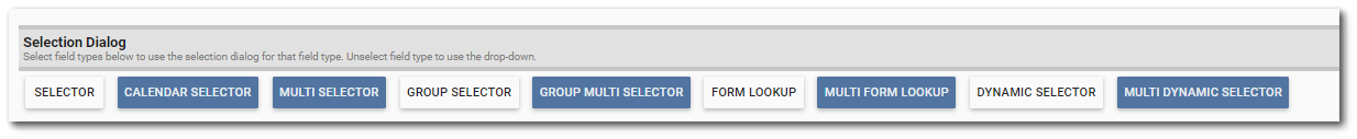
The Web Forms widget supports use of many field types that have selection options (selector, multi-selector, group selector, group multi-selector, form lookup, multi-form lookup, dynamic selector, and multi-dynamic selector). On the Web Forms Grid Entry screen, users can obtain values for these fields with either a drop-down list or a dialog. By default, the multi-selector fields will use the dialog while the single selector fields will use the drop-down. This can be changed by selecting/unselecting the buttons represented by the corresponding field. If the button is selected (blue), the field will use the dialog option. If the button is not selected (white), the field will use the drop-down option.
Date Format
For date field types (date and datetime), users can choose to have direct data entry or choose the date from a calendar. To use the calendar in data forms, check the Use calendar tool checkbox.
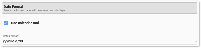
Users can select the format dates will be entered and displayed in Web Forms. Dates and datetimes will be expected to be entered in this format. If an invalid date is entered, the date will be cleared when entered. Available formats to choose from are:
•yyyy/MM/dd
•MM/dd/yyyy
•dd/MM/yyyy