This article describes how to use the Widget Editor to set the properties of the widget. The Widget Editor is accessed by selecting the More Options  icon in the upper right corner of the widget to open the drop-down menu and then selecting the Edit menu option.
The Widget Editor consists of a header and various properties of the widget. Each type of widget has a different set of properties. Some widget types do not have any additional properties. For more information on additional properties that are available for a specific widget, view the associated article for the widget.
Header
The top part of the Widget Editor is the widget header. The type of widget will always be displayed in the Widget Editor header, regardless of what is in the widget title.
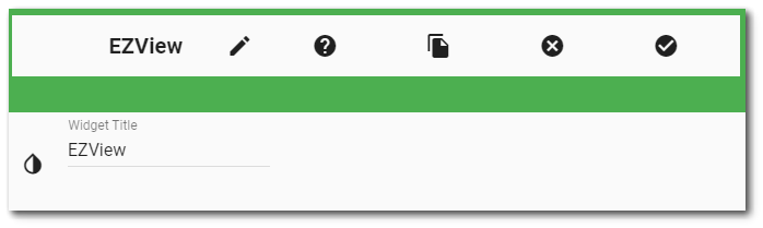
Within the header, the following properties can be set or actions can be taken:
•Widget Title – The name of the widget is displayed by default. Edit the title of the widget by typing directly into the title text box in the header. The title of the widget will be displayed on the dashboard.
•Widget Description – The description field provides a caption of the widget content for screen readers. This field improves accessibility by allowing visual elements such as charts to be given accessible text descriptions. It also displays a tooltip when hovering on the widget header. Default text (of the widget type's description) is provided but can be edited by users for additional context. This field has a 250-character limit.
•Widget Theme – The default widget color is white. Change the background color of the widget header by selecting the Widget Theme icon and then choosing one of the colors from the drop-down menu. Available colors are red, green, blue, purple, black, and white.
•Widget Object Editor – To set various appearance properties of the widget, select the Object Editor  icon in the widget header to open the Widget Object Editor. After editing the JavaScript Object Notation (JSON) for widget properties, click the Save
  icon in the Widget Object Editor to save the changes. Click the Close
  icon in the Widget Object Editor to close the editor without saving changes.
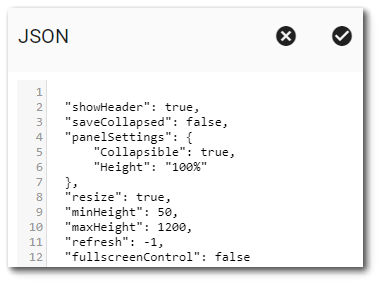
To configure a widget to not display a header, set showHeader to False. When the widget header is set to not display, the More Options menu can be accessed by right-clicking on the widget. If an option is not selected, the More Options menu can be cleared by left-clicking in blank space elsewhere on the Dashboard.
To configure a widget to refresh automatically, add a property called refresh (if it does not already exist) and set it to a non-zero number that is the refresh rate (in seconds). For example, refresh with a value of 60, would refresh the widget every 60 seconds.
Setting Collapsible to true displays the Collapse icon  on the widget header and allows the widget to be collapsible (i.e., only display the widget title bar). Setting saveCollapsed to true allows the collapsed state to persist beyond the current session. Setting saveCollapsed to false results in the widget always being fully displayed when the dashboard loads. Changes made in the Widget Object Editor are saved when the Widget Editor is saved.
•Help – The Help  icon connects to the online documentation related to the specific widget.
•Copy Settings – Select the Copy Settings  icon to to copy the settings from another widget of the same type. See the Copy Widget Settings article for more information.
•Cancel – Select the Close without Saving icon to exit the Widget Editor without saving changes.
•Save – Changes will be applied to the widget by clicking on the Save icon. The Widget Editor will close after the save operation is complete.