Overview
The Data Grid widget displays the output of a grid report in a sortable, filterable grid with paging. An EQuIS Information Agent (EIA) for a grid report can be a data source for the widget. Users cannot load non-grid reports, such as those with Excel-only output, into the widget.
Since the visibility and order of report fields can be configured, this widget is useful for reviewing data without downloading the full report output. When properly configured, values in the data grid are editable and can send OData requests, which allow users to update existing records in the database (see OData in Data Grid Widget).
Users can also set up Dashboard Filtering through the Data Grid widget, using the underlying report's parameters as the filters and the data as the filter values. The Data Grid widget also supports filtering using Dashboard Filter Widgets (if not set as a dashboard filter). When using the Chrome browser, individual cell selection in the data grid is functional.
Note: The Data Grid widget will run the underlying report with each action (sort, filter, switch pages, change page size, etc.). EarthSoft highly recommends using report caching (see User Profile) when using the Data Grid report. Report caching will significantly reduce database load and improve the end user experience while using the widget. |
Grid Controls
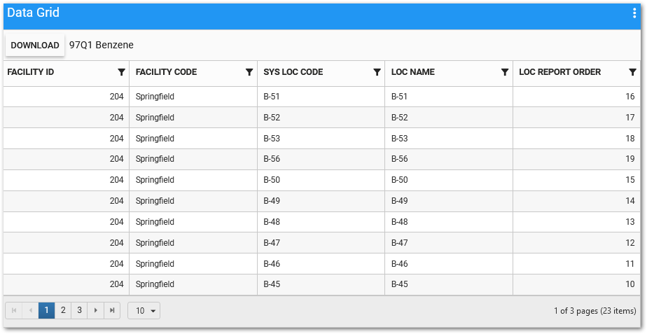
The Data Grid widget allows users to sort and filter columns, download the Data Grid data, adjust how many records are displayed per page, and move between pages.
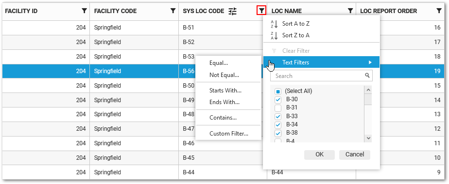
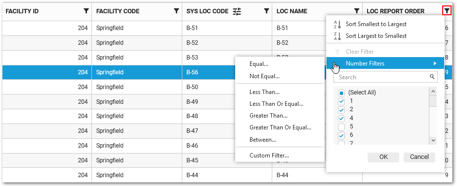
Sorting and Filtering – The Data Grid widget has flexible column sorting and filtering of text and numbers so users can easily fine tune the results. Each column displays a filter icon  to the right of the column header. Clicking the filter icon opens a modal with filter, sort, search, and selection functionality. The columns are sortable in ascending or descending order and the sort is applied to full report output (with filter, if applicable); it does not just apply to the currently visible page of the grid. Depending on the contents of the selected column, there are either text or numeric filter options, a search box that allows users to search for a specific value, and selectable check boxes to display only the desired results. The Custom Filter option allows for enhanced filtering, such as AND/OR comparisons based on specific values.
Note: Filtering is cumulative if multiple columns are filtered. |
The screenshots below show the text and numeric column sorting and filtering options, which are displayed based on the contents of the selected column. The SYS LOC CODE column (left screenshot) contains letters followed by numbers, so the text sorting and filtering options are displayed. The LOC REPORT ORDER column (right screenshot) contains only numbers, so the numeric sorting and filtering options are displayed.
Text Sorting/Filtering Options: |
Numeric Sorting/Filtering Options: |
|---|---|
|
|
Download – Click the Download button to download all pages of the grid data as a Microsoft Excel file (*.xlsx). The downloaded file will respect any active filter and/or sort currently applied to the grid.
Paging – The bottom of the widget contains paging controls for displaying a limited number of items at a time.
Widget Properties
The Data Grid widget is empty when added to a dashboard and must be configured to show report results. The editor for this widget allows the user to select a report, and then use the columns from the report to configure the widget appearance. The columns that are displayed and their order are controlled by the widget properties.
To edit widget properties, open the Widget Editor by selecting More Options  > Edit in the Widget Header. The Widget Editor includes two tabs used to define what and how the widget contents are displayed: Report and Advanced.
For information on these general options, see the Widget Editor article:
•Widget Title •Widget Description •Widget Theme |
•Object Editor •Help •Copy Settings |
•Close without Saving •Save |
Report Tab
Report Chooser – This control is used to select the report or EIA to be used with this instance of the Data Grid widget. The name of the currently selected report (if applicable) is displayed by default. To select a different report or EIA, click the Choose a Report button or name of the report. The Report Chooser will open and display available reports. Select the desired report or EIA.
Notes: •Because the report output is displayed as rows of data in a grid, you must choose a report that produces a table of data (i.e., an IGridReport). •Reports with apostrophes/special characters in the columns will not load in the Data Grid Widget. |
Report Parameters – The report parameters (e.g., facility, sample date range, etc.) can be edited by clicking on the Edit  button to open the Report Parameter Editor for the selected report. A user with editor permission on the selected report may update the report.
After choosing a valid grid report, the widget will run the report and display the output columns for the report in a grid table. Use the table columns to configure the grid displayed by the widget.
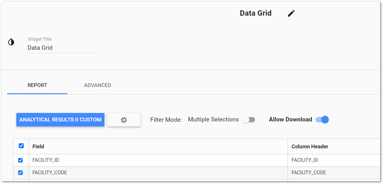
Filter Mode – The "Multiple Selection" option enables users to select multiple rows in the data grid, which allows filtering on multiple values simultaneously. By default, this option is disabled. Move the slider to the right to enable this option.
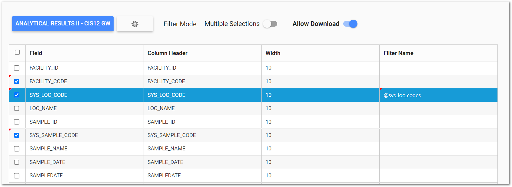
The fields will display in the Data Grid widget as columns in the order they are listed within the Widget Editor. To change the order of the columns as they are displayed in the data grid, drag and drop the column rows (i.e., fields) to the desired display order.
Allow Download – This toggle allows users with the Editor permission to prevent users from downloading data. When toggled on, the value of "true" will be added to the "allowDownload" key in the Advanced tab. When toggled off, "false" will instead be added.
Show/Hide Fields – The check box determines whether or not the field will be included in the data grid as a column. The person viewing the data grid can show/hide columns within the grid itself, but they will only be able to see the fields that are selected in the Widget Editor. If a field is not checked in the editor, the person viewing the data grid will not be able to see that field. Click the header check box to automatically show/hide all columns.
Column Header – The column names are listed as input text boxes. The name of the column is displayed in the grid as is but can be changed. For example, to display the SYS_LOC_CODE column as "Location", change the column name in the text box to "Location".
Width – This number is the approximate width of the column as a percentage of the entire width of the data grid. The default column width is 10. Adjust the column width as desired.
Filter Name – Click the drop-down menu in the target field row and select the desired filter name. For example, select @sys_loc_codes for a field displaying location names. Multiple fields can be set as filters. See the Dashboard Filtering page for more information about using the Data Grid widget as a dashboard filter.
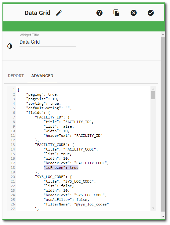
Advanced Tab
The Advanced tab displays the widget settings as raw JavaScript Object Notation (JSON). This allows for easy copying and pasting, as well as maintaining the ability to edit, add, or remove properties. See the OData in Data Grid Widget article for details on configuring OData requests using JSON on the Advanced tab of the Widget Editor.
Note: Any errors in the JSON will disable the Report tab. Resolve the JSON error to re-enable the Report tab. |
isFrozen Property – Implements the ability to "Freeze" columns in the Data Grid widget. The isFrozen property can be applied to as many columns as desired by the user. The "isFrozen": true JSON property must be added manually to the desired column's object; it is not included in the JSON by default. isFrozen will default to false for all columns. The frozen columns will always stick to the left side of the data grid, and will be ordered based upon the column ordering set on the Report tab.
isUrl Property – This property allows columns in the Data Grid widget to display their values as clickable hyperlinks. The "isUrl": true JSON property must be added manually to the desired column's object; it is not included in the JSON by default. Once set, this property treats values for the column as hyperlinks. This allows users with custom reports or columns that contain a URL be used as a clickable link from the Data Grid widget. For an external link, the URL will need to include the http:// or https:// protocol for the hyperlink to recognize it as an outside source. If the protocol is not provided, the URL will be treated as a relative link and attempt to find the location in the current solution.