By default, all widgets have a header that appears at the top of the widget that includes the widget title and a More Options  icon. A widget can be configured to not display the header (see Widget Editor article). When the widget header is set to not display, the More Options menu can be accessed by right-clicking on the widget.
Widget Title – The widget title is at the left of the widget header and may be modified in the Widget Editor.
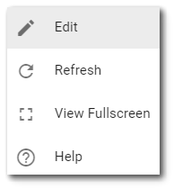
Select the More Options Edit – Selecting the Edit menu option will open the Widget Editor. Refresh – Selecting the Refresh menu option will refresh the widget, similar to refreshing a web page within the browser. View Fullscreen – Selecting this option will expand the widget to display as fullscreen. Select the More Options Help – Selecting Help menu option opens the Enterprise documentation in a new tab.
If an option is not selected, the More Options menu can be cleared by left-clicking in blank space elsewhere on the Dashboard. |
|
A widget can be set to be collapsible (i.e., only display the widget title bar) and a Collapse icon  will be displayed on the widget header. The collapsed state can be set for only the current session or to persist when the dashboard loads again. These properties are set in the Widget Editor.
Note: Widgets can be moved while editing the dashboard by clicking on the widget header and dragging the widget to a new section of the dashboard. |
|---|
Note: Some properties may not be available for a widget. This is dependent upon how the dashboard or widget has been configured and permissions granted for the dashboard. |
|---|