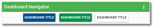
The Dashboard Navigator widget provides users with an easy and intuitive way to navigate to their dashboards. The widget can be used to navigate between dashboards by clicking added buttons. The navigation buttons can be added, edited, and removed inside of the Widget Editor.
Widget Properties
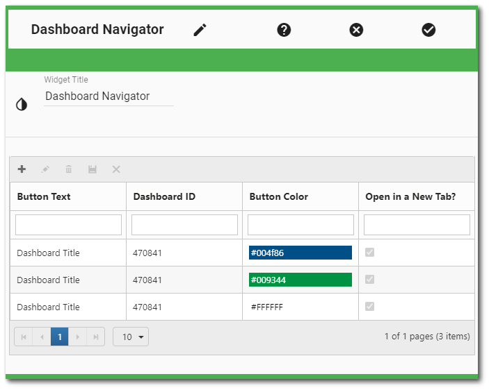
The Dashboard Navigator widget is empty when added to a dashboard and must be configured to display buttons and links to other dashboards. The editor for this widget allows the user to add, edit, or remove buttons and configure the widget appearance. Open the Widget Editor by selecting the More Options  icon in the upper right corner of the widget to display the drop-down menu and then select the Edit menu option.
Widget Title – By default, the widget title is Dashboard Navigator. The title can be modified.
Widget Description – The description field provides a caption of the widget content for screen readers. This field improves accessibility by allowing visual elements such as charts to be given accessible text descriptions. It also displays a tooltip when hovering on the widget header. Default text (of the widget type's description) is provided but can be edited by users for additional context. This field has a 250-character limit.
Widget Color – The color of the widget can be changed using the Widget Theme icon to the left of the widget title.
Widget Object Editor – To set various appearance properties of the widget, select the Object Editor  icon in the widget header to open the Widget Object Editor. See the Widget Editor article for more details.
Help – The Help  icon connects to the online documentation related to the specific widget.
Copy Settings – Select the Copy Settings  icon to to copy the settings from another widget of the same type. See the Copy Widget Settings article for more information.
Cancel – Select the Close without Saving  icon to exit the Widget Editor without saving changes.
Save – Changes will be applied to the widget by clicking on the Save  icon. The Widget Editor screen will close after the save operation is complete.
Add Navigation Button
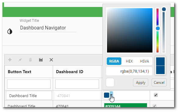
To add a new navigation button to the widget, click the Add  icon on the toolbar of the view grid frame. The Dashboard Chooser will open. Select the desired dashboard. The dashboard will appear in the view grid with the dashboard name as the Button Text and the Dashboard ID field populated. By default, the Button Color is set to white and Open in a New Tab? is set to false (i.e., unchecked). The navigation button can now be edited. The button color can be defined by picking a color from the selector or by entering specific RGBA, HEX or HSVA values.
Edit Navigation Button
Edit mode can be accessed two ways: (1) Select the row in the view grid and then click the Edit  icon on the toolbar of the view grid frame, or (2) double click the row in the view grid. The user can set navigation button text, button color, and if the dashboard should open in a new tab. To save edits to the dashboard button, click the Save
  icon on the toolbar of the view grid frame. Changes will not persist if the user only clicks save in the Widget Editor without first saving the changes in the view grid.
Delete Navigation Button
If a navigation button needs to be deleted, select the row in the view grid and then click the Delete  icon on the toolbar of the view grid frame. The selected button will be deleted.