The Vertical Profile Chart widget displays analytical result data with respect to depth for a given location. Data for such a chart can come from the EarthSoft-standard Basic Results and Downhole Point reports, among others. The widget is highly configurable—titles, axes, legends, etc.
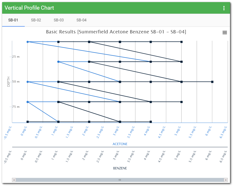
Chart Header
The header of each chart displays the following items:
Title – The title of the chart.
Chart Context Menu – The Chart Context Menu is used to print or download the visible chart as an image file.
Chart Title
The chart title can be set in the widget editor (see Chart Options). The chart title will be displayed at the top-center of the chart. If desired, a subtitle may also be added in the Advanced tab of the widget properties.
Note: The title of each chart can be set to the corresponding tab name by entering "{$tab}" (without the quotes) into the "Chart Title" box on the Chart tab of the widget properties. Alternatively, enter "{$tab}" in the "title" section of the Advanced tab. |
|---|
Chart Context Menu
The Chart Context Menu is available by clicking the button (![]() ) in the top-right corner of the chart. The Chart Context Menu allows the user to:
) in the top-right corner of the chart. The Chart Context Menu allows the user to:
•Download CSV – Download a comma-separated values (CSV) file. A CSV file is a plain-text format used to represent tabular data.
•Download PNG – Download the visible chart as PNG (Portable Network Graphic) image.
•Download JPEG – Download the visible chart as JPG/JPEG (Joint Photographics Experts Group) image.
•Download PDF – Download the visible chart as PDF (Portable Document Format).
•Download SVG – Download the visible chart as SVG (Scalable Vector Graphic) image.
•Print – Send the visible chart to the printer.
Tooltip
Hovering the mouse over the chart will display a tooltip. The top line of the tooltip contains the date/time value at the current point on the time axis (i.e., X-axis). The date/time will be displayed based on the culture specified in the current browser settings. Following the date/time value, each series within each chart will be listed (assuming the series has a value for the current date/time). The series name will be followed by the section name, value, and unit. The values will be displayed with the number format based on the culture specified in the current browser settings.
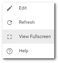
Fullscreen
If enabled in the widget properties, the Vertical Profile Chart widget can be viewed fullscreen. Select the More Options ![]() icon in the upper right corner of the widget to display the drop-down menu and then select the View Fullscreen menu option.
icon in the upper right corner of the widget to display the drop-down menu and then select the View Fullscreen menu option.
Widget Properties
The Vertical Profile Chart widget is empty when added to a dashboard and must be configured to show report results. The editor for this widget allows the user to select a report, and then configure the widget appearance.
To add data (select a report) or change properties of this widget, open the Widget Editor by selecting the More Options ![]() icon in the upper right corner of the widget to display the drop-down menu and then select the Edit menu option. The widget properties are divided into four tabs: Series Data, Chart Options, Add Report Data, and Advanced.
icon in the upper right corner of the widget to display the drop-down menu and then select the Edit menu option. The widget properties are divided into four tabs: Series Data, Chart Options, Add Report Data, and Advanced.
Widget Title – By default, the widget title is Vertical Profile Chart. The title can be modified.
Widget Description – The description field provides a caption of the widget content for screen readers. This field improves accessibility by allowing visual elements such as charts to be given accessible text descriptions. It also displays a tooltip when hovering on the widget header. Default text (of the widget type's description) is provided but can be edited by users for additional context. This field has a 250-character limit.
Widget Color – The color of the widget can be changed using the Widget Theme![]() icon to the left of the widget title.
icon to the left of the widget title.
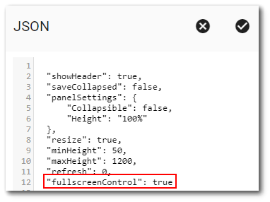
Widget Object Editor – To set various appearance properties of the widget, select the Object Editor ![]() icon in the widget header to open the Widget Object Editor that displays the JSON (JavaScript Object Notation) properties for the widget. To enable full screen control of the Vertical Profile Chart widget, change the fullscreenControl property from "false" to "true". See the Widget Editor article for more details on editing widget properties.
icon in the widget header to open the Widget Object Editor that displays the JSON (JavaScript Object Notation) properties for the widget. To enable full screen control of the Vertical Profile Chart widget, change the fullscreenControl property from "false" to "true". See the Widget Editor article for more details on editing widget properties.
Help – The Help ![]() icon connects to the online documentation related to the specific widget.
icon connects to the online documentation related to the specific widget.
Copy Settings – Select the Copy Settings ![]() icon to to copy the settings from another widget of the same type. See the Copy Widget Settings article for more information.
icon to to copy the settings from another widget of the same type. See the Copy Widget Settings article for more information.
Cancel – Select the Close without Saving ![]() icon to exit the Widget Editor without saving changes.
icon to exit the Widget Editor without saving changes.
Save – Changes will be applied to the widget by clicking on the Save ![]() icon. The Widget Editor screen will close after the save operation is complete.
icon. The Widget Editor screen will close after the save operation is complete.
Series Data Tab
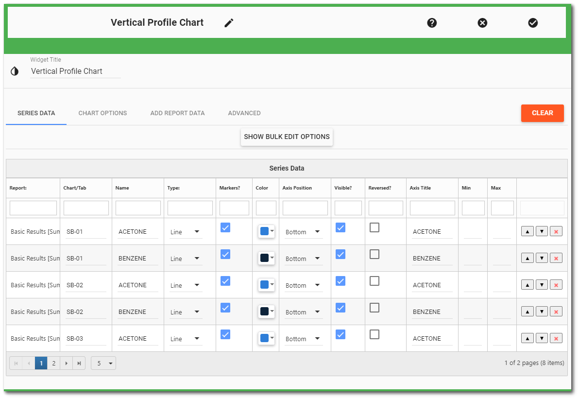
The Series Data tab allows the user to view/edit the properties for any chart series added to the widget. Each series is displayed in the Series Data grid. If the number of series exceeds the selected rows per page limit, multiple pages will be available. If the series are grouped by chart, each chart and the associated series are displayed on a separate page. The paging controls are at the bottom of the widget.
The Series Data tab has a bulk editing feature, which can be used to set values for all series. Clicking the Show Bulk Edit Options button will display a table with available bulk editing options. Select the check box in any of the option headers to enable that option for editing. Enabled options are shown with a red back-ground. Change the activated values and click the Apply button to apply that value to all the series in the widget. Note that these changes are applied to all series, not only those displayed in the current page of the Series Data grid.
If more than one series is listed, up/down arrows will appear to the right of the series. Click the up/down arrows to change the display order of the series. Click the red "x" button to delete a series.
The following properties can be set for each series:
•Chart/Tab – Set the name of the chart tab for displaying a separate tab based on a differentiating factor (e.g., edit the chart tab name to match the SYS_LOC_CODE value).
•Name – Set the name of the series (as displayed in the Legend and the Tooltip).
•Type – Set the type of series that will be displayed as follows:
oLine – A line chart.
oSpline – Similar to a line chart, with additional smoothing between points.
oArea – Similar to a line chart, but the series color extends below the line to the bottom axis.
oColumn – A column chart, where each data point is represented as a vertical column.
•Markers – Toggle display of markers for the series.
•Color – Choose the color for the series. If the color is not changed, then it will be determined by the selected Theme (and will change if the Theme is changed). If the color is changed, then the color selected will be used regardless of the Theme.
•Axis Position – Set the axis for which the series will be associated (Bottom or Top).
•Visible? – Set the axis visibility.
•Reversed? – Set whether the axis should be reversed.
•Title – Set the text that will be used for the axis title.
•Min – Set the minimum value that will be used for the range of the axis. Leave this value blank to have the chart automatically set the minimum value (see Equalize Value Range).
•Max – Set the maximum value that will be used for the range of the axis. Leave this value blank to have the chart automatically set the maximum value (see Equalize Value Range).
Chart Options Tab
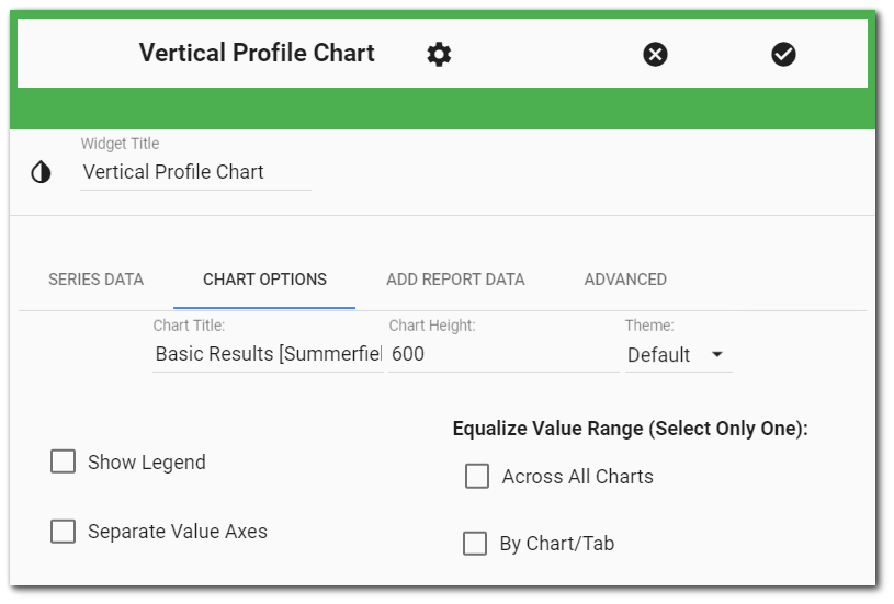
The Chart tab allows the user to edit the chart properties as follows:
•Chart Title – Optionally, the user may set the text that will be used as the title of the chart.
•Chart Height – The height of the chart (in the number of pixels) must be specified.
•Theme – Optionally, an alternate theme may be selected for the chart.
•Show Legend – Check/uncheck this check box to show/hide the Legend.
•Separate Value Axes – Check this box to display separate values on all axes for charts with different series.
•Equalize Value Range – By default, each chart will automatically adjust its vertical range (i.e., the minimum and maximum values of the vertical axes) based on the data within that chart. Two options exist to equalize the vertical range of each chart across the entire widget: (1) Across all charts and (2) By chart/tab.
Checking the "Across all charts" box equalizes the vertical axis of all the charts based on the report's ranges.
Example: Locations are grouped for each chart (e.g., Group Charts By = SYS_LOC_CODE). The values for the first location may range from 0 to 10, whereas the values for the second location may range from 0 to 80. By default, the vertical range of each chart will adjust based on its values, which could make the series appear to have similar magnitude within each range. If you want to visually compare series across charts, it is worthwhile to make each chart display the same vertical range. Checking the "Across all charts" box would make each chart have the same vertical range, based on the minimum and maximum values of all series in the widget (i.e., 0 to 80).
Checking the "By Chart/tab" box equalizes the vertical axis on each chart tab based on the data range of each chart rather than the data range of the whole report. Hence, each chart has its own range rather than the same range applied to all charts.
Example: Locations are grouped for each chart (e.g., Group Charts By = SYS_LOC_CODE), but multiple series are plotted on each chart. The data ranges by orders of magnitude across the sampling locations. Therefore, equalizing the vertical axis across all charts would not be useful. However, at each location, having the same vertical axis for the sampled analytes would allow an easy comparison of chemical concentrations.
Add Report Data Tab
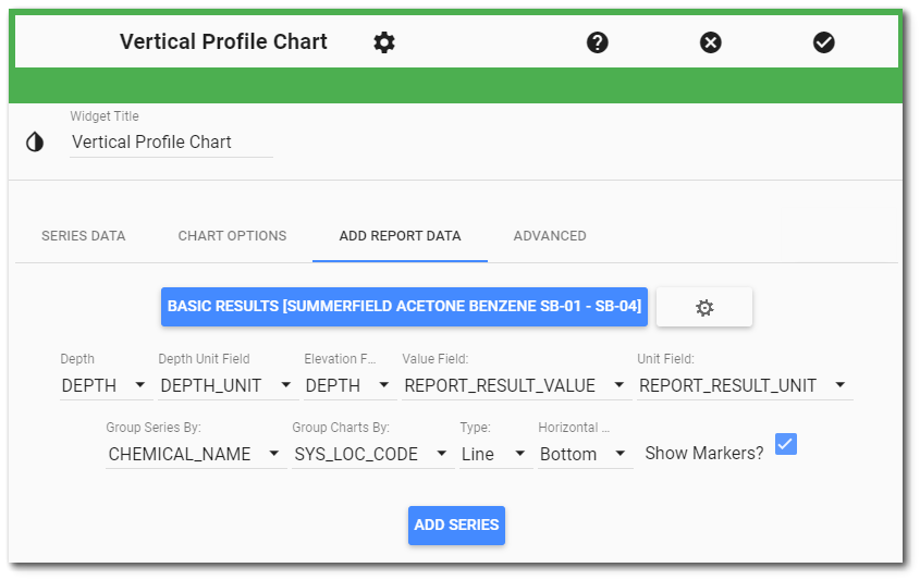
The Add Report Data tab allows the user to add data series to the widget. To add a series, follow the instructions below. Repeat the same steps to add as many series as desired. For example, to add series from multiple values of the same report (e.g., REPORT_RESULT_VALUE, ACTION_LEVEL) or series from different reports (e.g., analytical results and water levels).
Report – Select the report (Report Chooser) that will provide data for the series. Choose from an existing report or choose desired input parameters and save a new report.
Depth Field* – Choose the column of the report to use for depth.
Depth Unit Field* – Choose the column of the report that specifies the unit for the selected value (e.g., DEPTH_UNIT, REPORT_RESULT_UNIT, etc.).
Elevation Field* – Choose the column of the report to use for elevation.
Value Field* – Choose the column of the report to use for the value. Only numeric fields are available (e.g., REPORT_RESULT_VALUE, EXACT_ELEV, PARAM_VALUE, ACTION_LEVEL, etc).
Unit Field* – Choose the column of the report that specifies the unit for the selected value (e.g., REPORT_RESULT_UNIT, DEPTH_UNIT, etc).
Group Series By – Optionally, choose a column that will be used to group series. A series will be created for each unique value in this column.
Group Charts By – Optionally, choose a column that will be used to group charts. A chart will be created for each unique value in this column.
Type – Select the type of series to be added (series types are defined above).
Horizontal Axis – Select the horizontal axis (Top or Bottom) for which the series will be associated.
Show Markers? – Check the box to display the markers for the series.
Click the Add Series button to add the series to the chart. After the process is complete, the Chart Options tab will be active.
*After choosing the report, wait a few moments for the drop-down lists to be populated. The fields that are available to choose from are based on the output of the selected report.
Advanced Tab
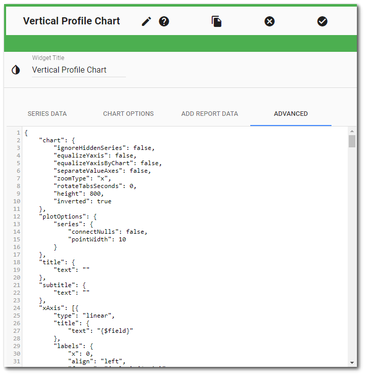
The Advanced tab displays the JSON text of all of the chart properties. Any changes to the properties on the Series Data or Chart Options tabs will automatically be displayed on the Advanced tab, and vice versa. Expert users may edit the JSON text directly to modify advanced properties of the chart (see the Highcharts website for more information: http://www.highcharts.com/docs). Invalid JSON will result in an error, and the Widget Editor cannot be saved until the error is resolved.
Marker Fill Based on Boolean Column Values
The Time Series Chart widget can differentiate marker fill based on Boolean column values (e.g., DETECT_FLAG). To use this feature, add the "detectColumn" property to any series object and set its value to a Boolean column. For example:
"detectColumn": "detect_flag"
where "detect_flag" is the name of a Boolean column.
When the specified column has a TRUE Boolean value (e.g., T, True, Yes, etc.), the marker for the record will be filled. When the specified column has a FALSE Boolean value e.g., (F, False, No, etc.), the marker for the record will be unfilled.
Note: If the "detectColumn" property has been added to a series object, markers will always be visible, even if the series marker "enabled" property is set to False. |
|---|