The Traffic Light widget displays good/bad summary data from a report. This widget shows report data as four states: Alert ( ), Warning (
 ), OK (
 ), and Unknown (
 ). The blue Unknown icon displays results that do not meet any of the set criteria. This widget is normally used for analyte exceedances, but can be used for any other type of data by configuring the conditions for each of the breaks.
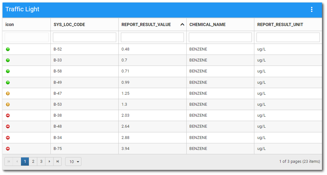
The data columns of the Traffic Light widget can be filtered and the designated sort column is sortable.
Sorting – The sort column set in the Widget Editor is sortable in ascending or descending order by clicking on the column header (click again to reverse the sort). The sort is applied to full report output (with filter, if applicable); it does not just apply to the currently visible page of the grid.
Filtering – Beneath each column header is a filter box that filters on that column only. Enter a search term (one or more characters) in the appropriate search box beneath the column header. Only records that contain the search term will be displayed. Filtering is cumulative if multiple columns are filtered.
Widget Properties
The Traffic Light widget is empty when added to a dashboard and must be configured to show report results. The editor for this widget allows the user to select a report, and then configure the widget appearance.
To add data (select a report) or change properties of this widget, open the Widget Editor by selecting the More Options  icon in the upper right corner of the widget to display the drop-down menu and then select the Edit menu option.
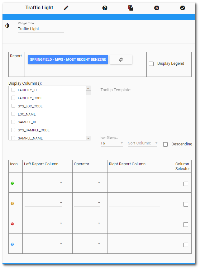
Widget Title – By default, the widget title is Traffic Light. The title can be modified.
Widget Description – The description field provides a caption of the widget content for screen readers. This field improves accessibility by allowing visual elements such as charts to be given accessible text descriptions. It also displays a tooltip when hovering on the widget header. Default text (of the widget type's description) is provided but can be edited by users for additional context. This field has a 250-character limit.
Widget Color – The color of the widget can be changed using the Widget Theme icon to the left of the widget title.
Report Chooser – This control is used to select the report to be used with this instance of the Traffic Light widget. The name of the currently selected report (if applicable) is displayed by default. To select a different report, click the Choose a Report button or name of the report. The Report Chooser will open and display available reports. Select the desired report.
Report Parameters – The report parameters (e.g., analyte, sample date range, etc.) can be edited by clicking on the Edit button  to open the Report Parameter Editor for the selected report. A user with editor permission on the selected report may update the report.
Display Legend – The display of a legend can be toggled on and off. The legend will contain each icon, as well as all report columns, operators, and manually-inputted values.
Display Column(s) – The columns listed in the Display Column(s) box are based on the chosen report. Select the column(s) to be displayed in the widget. The display columns will appear in the order they are selected.
Note: The functionality of the widget may vary depending on the data type of the selected column(s). For example, comparing a numeric value (e.g., REPORT_RESULT_VALUE) to a text value (e.g., ACTION_LEVEL) may not work—particularly in cultures that do not use a period as the decimal separator. To ensure proper operation, select columns of the same data type (e.g., REPORT_RESULT_VALUE and ACTION_LEVEL_VALUE). |
|---|
Tooltip Template – Sets the template for the tooltip, which is shown when a user hovers over an icon. The template can make use of the report columns in the following way: ${SYS_LOC_CODE}: ${REPORT_RESULT_VALUE}, or ${SYS_LOC_CODE}-${REPORT_RESULT_VALUE}. The column name must be enclosed in { }.
Example: ${SYS_LOC_CODE} - ${REPORT_RESULT_VALUE} - ${REPORT_RESULT_UNIT}
Icon Size – Select the size for the traffic light icons.
Sort Column – Select which column will be used to sort the results. Please note that this column needs to be selected for the Traffic Light widget to work.
Descending – Allows for sorting results in descending order. Useful for dates.
State Symbols – For each symbol (icon) row, select a report field in the Left Report Column, select an Operator, and add a value in the Right Report Column. The value can be typed in manually or can be another field in the report if the "Column Selector" box is checked (see below for greater detail). The criteria are assessed from top to bottom (green to red) with the bottom parameters taking priority. The blue symbols represent an unknown status and are displayed for any condition that does not meet the criteria set for red, yellow, or green symbols. The criteria for the blue symbol may be specified or left unset.
Column Selector – When the Column Selector box is checked, a drop-down of report fields is available in the Right Report Column and can be chosen as the value for comparison to the Left Report Column value. For example, to compare the REPORT_RESULT_VALUE to the ACTION_LEVEL_VALUE, select the REPORT_RESULT_VALUE as the Left Report Column and select the ACTION_LEVEL_VALUE as the Right Report Column.
Note: The functionality of the widget may vary depending on the data type of the selected column(s). For example, comparing a numeric value (e.g., REPORT_RESULT_VALUE) to a text value (e.g., ACTION_LEVEL) may not work—particularly in cultures that do not use a period as the decimal separator. To ensure proper operation, select columns of the same data type (e.g., REPORT_RESULT_VALUE and ACTION_LEVEL_VALUE). |
|---|
Widget Object Editor – To set various appearance properties of the widget, select the Object Editor  icon in the widget header to open the Widget Object Editor. See the Widget Editor article for more details.
Help – The Help  icon connects to the online documentation related to the specific widget.
Copy Settings – Select the Copy Settings  icon to to copy the settings from another widget of the same type. See the Copy Widget Settings article for more information.
Cancel – Select the Close without Saving  icon to exit the Widget Editor without saving changes.
Save – Changes will be applied to the widget by clicking on the Save  icon. The Widget Editor screen will close after the save operation is complete.