After an XY Chart is opened, set up chart parameters to generate charts. The chart parameters are in the Data tab (see image below), which includes the chart parameters area and the chart parameter values area. The chart parameter values area appears and updates whenever a parameter is clicked. In addition, the arrow button furthest to the right is used to hide or open the Data tab.
Note: If needed, hover the mouse in between the chart parameters area (left) and the chart parameter values area (right) until a divider sign occurs and then click/hold left-mouse key and drag/drop the divider line to change the size of the parameters area to the parameter value area. |
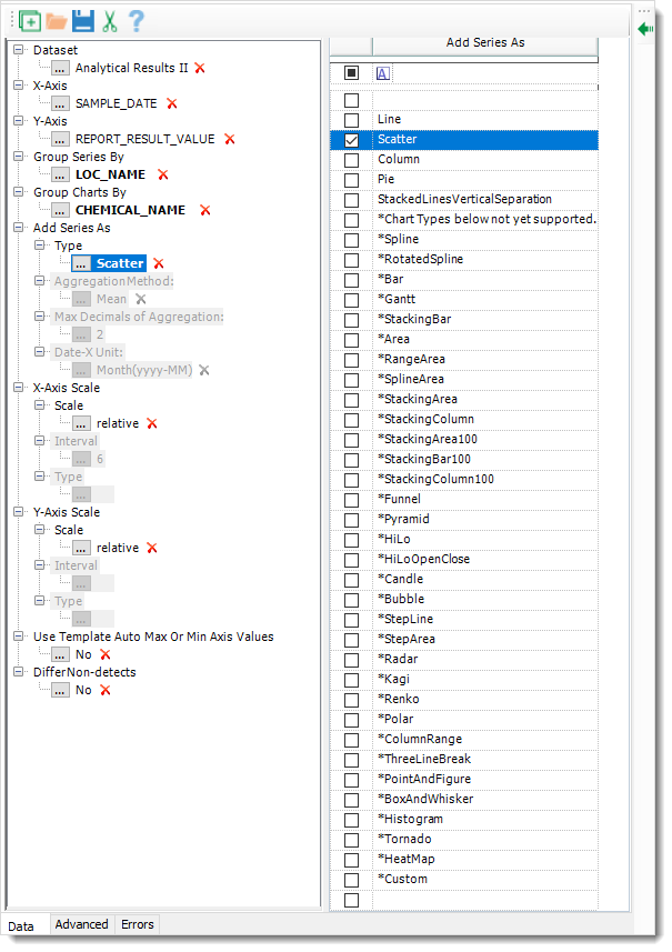
Chart Parameters
Dataset – Results (in a grid table) of a report, which can be filtered. XY Charts takes the filtered results as the source data of charting. It cannot be null or empty.
X-Axis – Select a column of the report result as X-axis. A column must be selected.
Y-Axis – Select a column of the report result as Y-axis. A column must be selected and must be a field containing numbers (or null values, which will be ignored).
Group Series By – Select a column of the report result to group chart series in a chart, of list type and single selection.
Group Charts By – Select a column of the report result to group charts to generate multiple charts, of list type and single selection.
Add Series As >
Type – Select a chart series type or chart type. It defaults to Line type. It cannot be null or empty.
Note that only the chart series types of Line, Scatter, Column, Pie, StackedLinesVerticalSeparation are fully tested and can be exported into an Excel file. If a user finds one or more of the test chart series types useful, they can ask for a feature request.
AggregationMethod – It is used for chart series types of Column and Pie. One of Minimum, Maximum, Mean, Sum and % as an aggregation method to Y values can be selected.
Max Decimals of Aggregation – It is used for aggregation calculations of chart series types of Column and Pie.
Date-X Unit – It is used for the chart series type of Column. It has selections of Default, Time(hh:mm:ss), Day(yyyy-MM-dd), Month(yyyy-MM) and Year.
X-Axis Scale >
Scale – Either relative or absolute. When relative is selected (by default), XY Charts automatically set up the layout of X-axis based on source data of each chart, giving each chart their own max/min of X-axis range values. In comparison, a fixed (max/min) X-axis range is calculated based on the source data of all the charts and applied to all the charts if absolute is selected. See Set Absolute X/Y Axis Scale for more details.
Interval – For absolute selection of scale interval.
Type – For absolute selection if the Y-axis is in a date format. It has selections of Auto, Years, Months, Weeks, Days, Hours, Minutes, Seconds and MilliSeconds.
Y-Axis Scale >
Scale – Either relative or absolute. When relative is selected (by default), XY Charts automatically set up the layout of Y-axis based on source data of each chart, giving each chart their own max/min of Y-axis range values. In comparison, a fixed (max/min) Y-axis range is calculated based on the source data of all the charts and applied to all the charts if absolute is selected. See Set Absolute X/Y Axis Scale for more details.
Y-Axis Scale > Interval – For absolute selection of scale interval.
Y-Axis Scale > Type – For absolute selection if the Y-axis is in a date format. It has selections of Auto, Years, Months, Weeks, Days, Hours, Minutes, Seconds and MilliSeconds.
Note: Settings made for the Interval do not carry over if exporting into Excel. The RangeType in the Advanced tab must be changed to "Set" following generation of the chart. Please refer to the X/Y-Axis Scale Settings page for more information on axis range settings. |
Use Template Auto Max Or Min Axis Values – Either Yes or No. It defaults to No. When Yes is selected and users load a saved template XML file, XY Charts applies the X/Y-axis ranges of the chart in the template to all the current charts. See Use Template Auto Max or Min Axis Values for more details.
Differ Non-detects – Either Yes or No. It defaults to No. When Yes is selected, a diamond symbol is applied to non-detect data points of a default scatter chart (the default symbol of the data points is circular). See Differ Non-detect Data Points for more details.