Scatter plots use X and Y axes to plot data similar to line graphs, but instead of a continuous function, dots represent individual pieces of data. These plots are useful to see if two variables are related to each other. Scatter plots are frequently used in assessments of geochemistry to understand the correlation between multiple analytes.
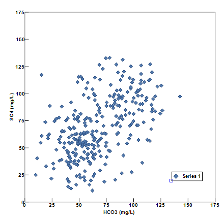
Multiple scatter plots can be placed on a single page by electing to make more than one scatter plot in a single window. This is advantageous to see differences in the relation of the two parameters at different wells, different well classes, or different dates. In each case, select a different symbol color or style to highlight these differences.
View a training video on Scatter Plots here.
To create full page scatter plots, open the Tasks Pane, select Create Window and then select Scatter Graph. A new view window is generated and the Scatter Graph dialog box opens. Scatter plots can also be created by selecting Window> New> Charts from a plan view map. A new view window is generated. Select Plot> Scatter to open the Scatter Graph dialog box. Modify the graph properties on the Query tab, Horizontal Axis tab, Vertical Axis tab, Format tab, Labels tab, and EQuIS Query tab as desired. Click the OK button to save changes.
Query Tab
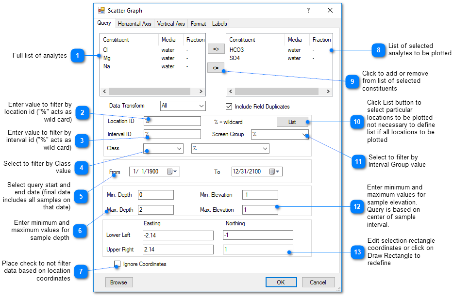
The List button enables individual wells to be selected for inclusion in the scatter plots.
Horizontal / Vertical Axis Tab
Interval – Specify the interval between labels on the axis. When Log Scale is chosen, the interval is integral powers of 10 (0.01, 0.1, etc.).
Digits Right of Decimal – Select the number of digits right of the decimal shown on the vertical axis.
Log Scale – Check to plot using a log scale.
Scientific Notation – Check to post values on axis using scientific notation.
Format Tab
Symbol Style – Select a symbol style from the drop-down menu.
Radius– Specify the size of the plotted symbol.
Labels Tab
Well ID labels can be plotted next to the symbols to see how the parameters correlate at different wells.