The EQuIS Live - Heatmap widget displays data in a tabular format. Data points in the chart are color-coded based on the range (lowest values to highest values) defined in the legend. The EQuIS Live - Heatmap widget provides a useful comparative visualization tool.
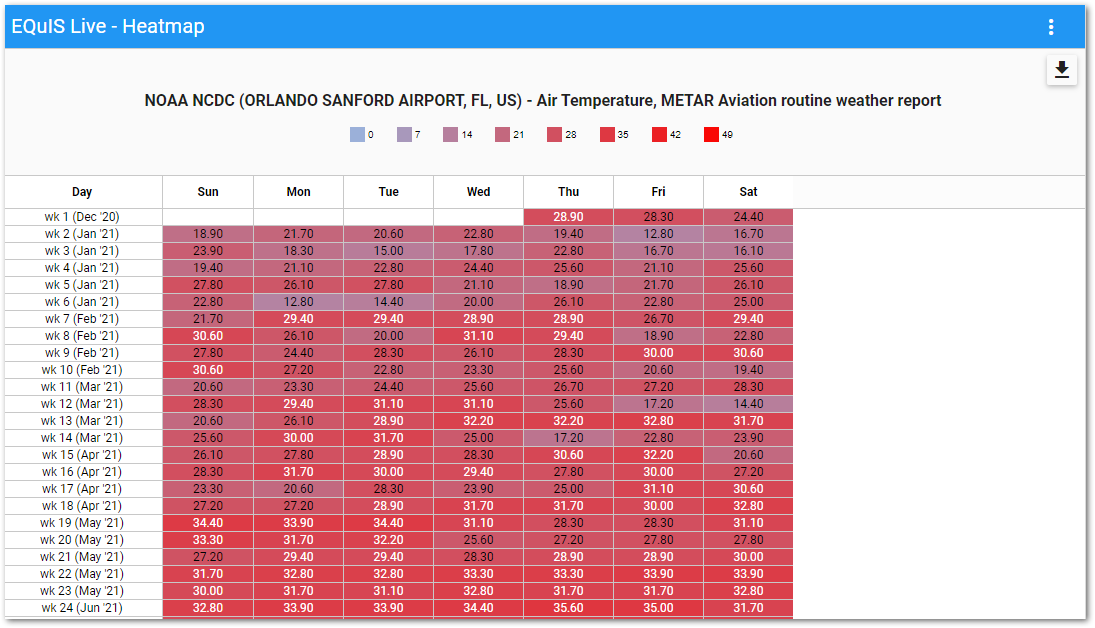
The widget contains two parts: a legend and a chart. The chart displays a tabular comparison of data points aggregated for a specified period over an interval of time.
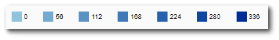
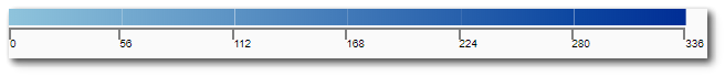
The legend displays information about the range of the plotted data points and to which color the data points will be mapped. The legend can display in either list mode or gradient mode. Gradient mode will display a triangle indicator on the legend when a user hovers over a specific value in the chart.
List Mode |
|---|
|
Gradient Mode |
|
Widget Editor
To open the Widget Editor, select the More Options ![]() icon in the upper right corner of the Heatmap widget to open the drop-down menu and then select the Edit menu option. The widget properties are divided into two tabs: Heatmap and Options.
icon in the upper right corner of the Heatmap widget to open the drop-down menu and then select the Edit menu option. The widget properties are divided into two tabs: Heatmap and Options.
Widget Title – By default, the widget title is EQuIS Live - Heatmap. The title can be modified.
Widget Color – The color of the widget can be changed using the Change Widget Theme![]() icon to the left of the widget title.
icon to the left of the widget title.
Help – The Help ![]() icon connects to the online documentation related to the specific widget.
icon connects to the online documentation related to the specific widget.
Copy – Select the Copy Settings ![]() icon to to copy the settings from another widget of the same type. See the Copy Widget Settings article for more information.
icon to to copy the settings from another widget of the same type. See the Copy Widget Settings article for more information.
Cancel – Select the Close without Saving ![]() button to exit the Widget Editor without saving changes.
button to exit the Widget Editor without saving changes.
Save – Changes will be applied to the widget by clicking on the Save ![]() button. The Widget Editor screen will close after the save operation is complete.
button. The Widget Editor screen will close after the save operation is complete.
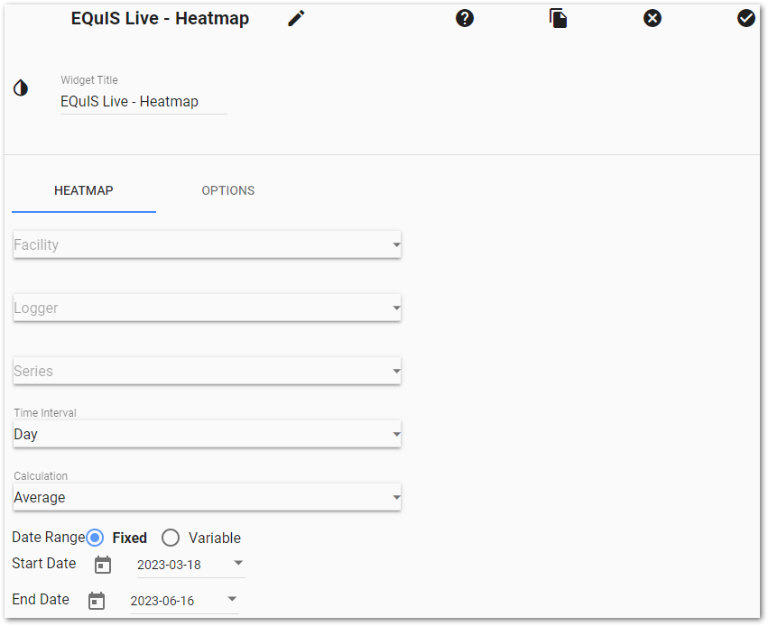
Heatmap Tab
To display a tabular chart for a series:
1.Select an EQuIS Facility (or select No Facility).
2.Select a Logger.
3.Select a Series within a Logger.
4.Select a Time Interval on which to aggregate the series' data.
a.For example, selecting "Hour" will plot the hourly aggregated data for each hour within a day for specified date range.
5.Select a Calculation method.
6.Select either a Fixed or Variable Date Range.
a.Fixed – Enter a Start Date and End Date. By default, Fixed is selected with the date range set to 90 days, with the End Date set to the current date and the Start Date set to 90 days earlier.
b.Variable – Enter a Value and Time Interval Unit.
Options Tab
The following parameters for the chart can be set on the Options tab:
•Chart Height.
•Column Width.
•Column Header Width.
•Legend Mode to either List or Gradient.
•Max Decimal Digits displayed in the chart.
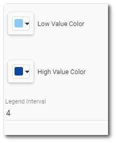
•Low Value Color for lowest value in data range.
•High Value Color for highest value in data range.
•Legend Interval to determine how many intervals to divide range of data. Must be a value from 1 to 10. Default is 4.
oFor example, if the user sets Legend Interval to 4 for data values ranging from 0 to 360, the legend would display points at 0, 90, 180, 270, and 360.