The Filter-List widget allows the user to select parameter values and filter the report output for reporting widgets (e.g., EZView, Traffic Light, Traffic Light Map, Time Series Chart, Map, Boring Log, and Data Grid) on the dashboard. See the Dashboard Filter Widgets article for more information on filter functionality, limitations, and interactions with other widgets.
The Filter-List widget must be configured prior to use. Each widget can only filter on a single type of parameter (e.g., analyte, location), selected in the Filter On parameter. The parameter values available in the widget can be restricted (e.g., display only certain locations). The widget can be configured to allow multiple parameter value selection by the user via the Select Multiple parameter.
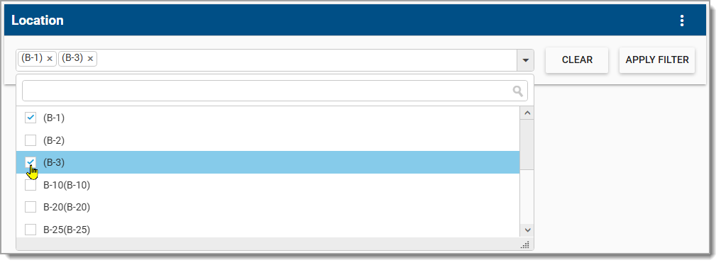
Once the Filter-List widget has been configured, a user can select values to filter report output using the Add to Widget List and/or Default Value check boxes, including an option to select all values in either column. When configured for single parameter value selection, the widget has a drop-down menu that closes once a selection is made. After the value has been selected, reporting widgets on the dashboard will update to reflect the filter change. When configured to select multiple parameter values, the widget has a scroll window from which to select values as well as an Apply button. The user must click the Apply Filter button to apply the filter selections to the reporting widgets on the dashboard.
For Filter-List widgets with a long list of parameters, the search box can be used to find the desired parameter. When multiple parameters are selected, an individual parameter can be removed from the filter by clicking the "x" to the right of the parameter name. Use the Clear button to remove all parameters from the filter.
Widget Properties
To configure the Filter-List widget, open the Widget Editor by selecting the More Options  icon in the upper right corner of the widget to display the drop-down menu and then select the Edit menu option.
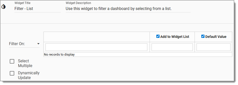
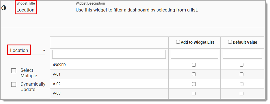
Widget Title – The widget title will automatically update to the parameter selection. The title can be modified.
Widget Description – The description field provides a caption of the widget content for screen readers. This field improves accessibility by allowing visual elements such as charts to be given accessible text descriptions. It also displays a tooltip when hovering on the widget header. Default text (of the widget type's description) is provided but can be edited by users for additional context. This field has a 250-character limit.
Widget Color – The color of the widget can be changed using the Change Widget Theme icon to the left of the widget title.
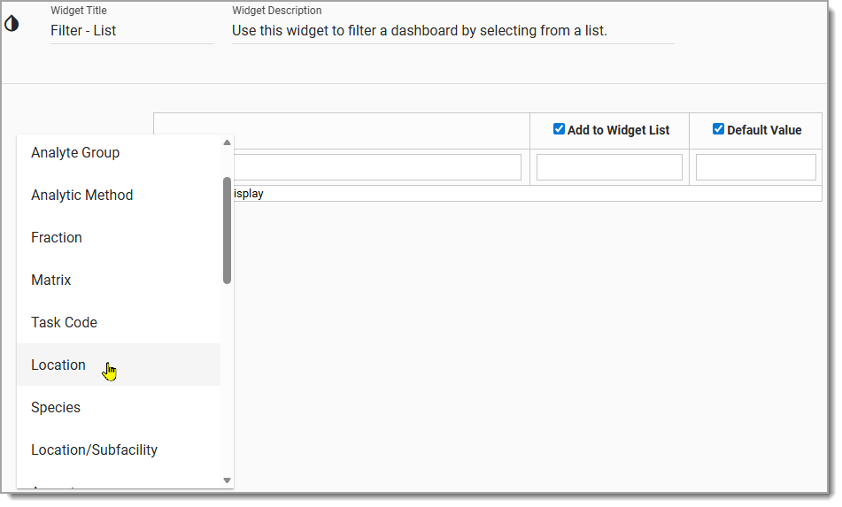
Filter On – From the Filter On drop-down menu, select the desired parameter upon which to filter. Note that when a filter parameter is selected the Widget Title will automatically update to reflect the parameter selection.
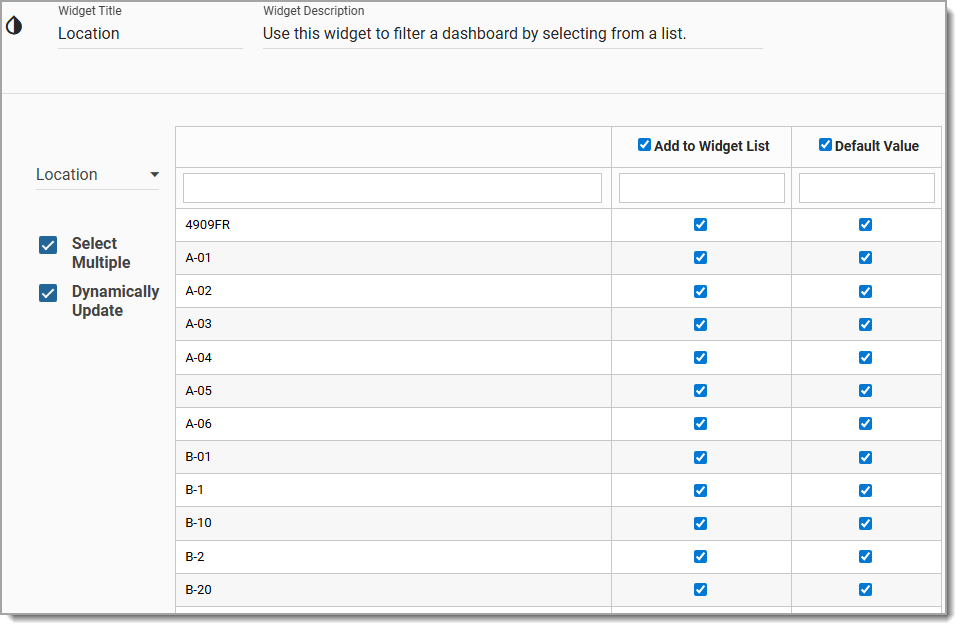
Select Multiple – To allow the dashboard user to select more than one parameter value, check the Select Multiple box. To dynamically fetch the filter options with all options available, check the Dynamically Update box.
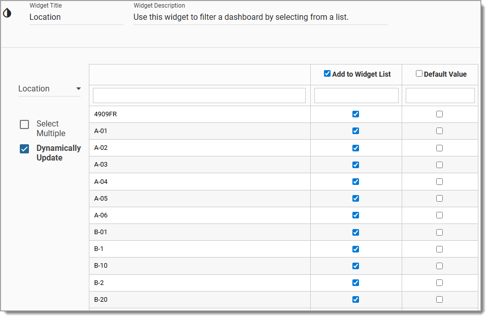
Populate Filter Values – Choose the values that will populate the Filter-List widget drop-down menu (i.e., the values that the dashboard user will see) by checking one or more of the filter value boxes in the Add to Widget List column.
Note: At least one value must be added to the filter for the filter to be functional. |
|---|
Default Value – Default values can be selected to automatically load when the dashboard loads. After loading, the filter will be applied and reporting widgets will be updated based on the configured default values. Default values can be set by selecting the check boxes in the Default Value column. Selecting a default value will automatically add it to the widget list visible on the Filter-List widget drop-down menu on the dashboard.
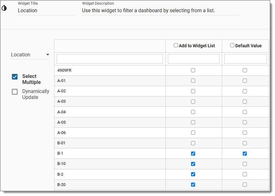
Select All – A check box is available to the left of both the Add to Widget List and Default Value column headers to select all records. Deselecting this check box will deselect all selected records. Selecting all values in the Default Value column will also select all values in the Add to Widget List column.
Widget Object Editor – To set various appearance properties of the widget, select the Object Editor  icon in the widget header to open the Widget Object Editor. See the Widget Editor article for more details.
Cancel – Select the Close without Saving  button to exit the Widget Editor without saving changes.
Save – Changes will be applied to the widget by clicking on the Save  button. The Widget Editor screen will close after the save operation is complete.
Help – The Help  button connects to the online documentation related to the specific widget.
Note: The Filter-List widget has eight options. The following are the corresponding parameter names overridden for each of the eight options: •Action Level: Overrides @action_level_codes •Analyte: Overrides @cas_rns •Analyte Group: Overrides @analyte_groups •Analytic Method: Overrides @analytic_methods •Fraction: Overrides @fractions •Matrix: Overrides @matrix_codes •Task Code: Overrides @task_codes •Location |
|---|