The Filter-Date Range widget allows the user to select parameter values and filter the report output for reporting widgets (e.g., EZView, Traffic Light, Traffic Light Map, Time Series Chart, Map, Boring Log, and Data Grid) on the dashboard. See the Dashboard Filter Widgets article for more information on filter functionality, limitations, and interactions with other widgets.
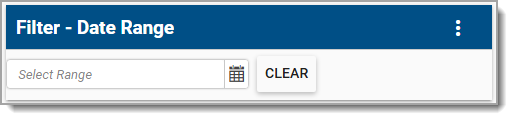
The Filter-Date Range widget has two display modes, Date Choosers and Year Drop-down List, which can be selected via the Display As parameter. By default, there are no dates or years configured, but users are able to configure the Default Value parameter in the widget editor to have a dashboard containing the Filter-Date Range Widget automatically filter content based on the selected value(s).
1.The Date Choosers display mode allows users to select a start date and end date, resulting in a custom date range to filter report outputs. Ensure the START_DATE and END_DATE report parameters are populated, if they exist.
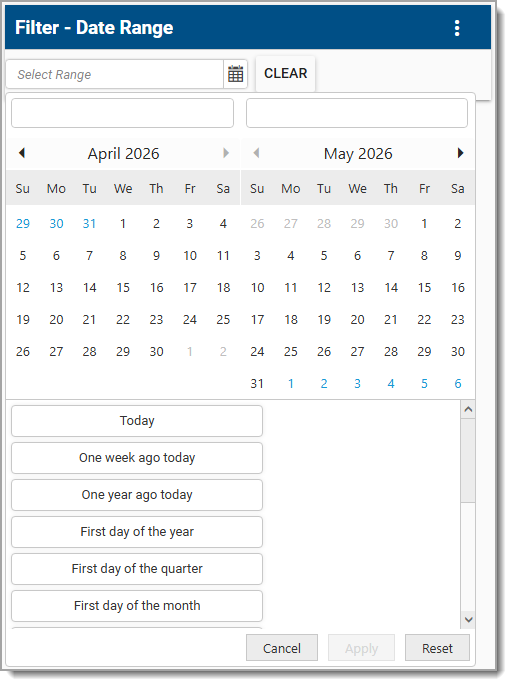
Note: The last option in the drop-down list is "Custom Picker", which allows a user to select a custom date range. All other options will automatically populate a date range based on the selection. When selecting "Custom Picker" the user will need to manually enter a start date (left date box) and end date (right date box) into the date boxes displayed above the calendar. |
|---|
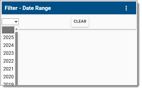
2.The Year Drop-down List display mode shows a drop-down list of recent years that can be selected. When selecting a year, the start date parameter is set with the first day of that year. The end date parameter is set to the last day of that year.
Widget Properties
To edit other widget properties, open the Widget Editor by selecting the More Options  icon in the upper right corner of the widget to display the drop-down menu and then select the Edit menu option.
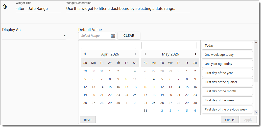
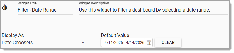
Widget Title – By default, the widget title is Filter-Date Range. The title can be modified.
Widget Description – The description field provides a caption of the widget content for screen readers. This field improves accessibility by allowing visual elements such as charts to be given accessible text descriptions. It also displays a tooltip when hovering on the widget header. Default text (of the widget type's description) is provided but can be edited by users for additional context. This field has a 250-character limit.
Widget Color – The color of the widget can be changed using the Widget Theme icon to the left of the widget title.
Display As – By default, the widget will be in the Date Choosers display mode. To set the display mode as Year Drop-down List, click the Display As drop-down menu and choose Year Drop-down List display mode.
Default Value – Set a default date value for dashboard filtering from either the Year Drop-down List or the Date Choosers. Click on the Apply button to save the user setting, click the Reset button to clear the selection, or click the Cancel button to close the Default Value modal. Click the Clear button to remove a default value. If a default value is applied and saved, the dashboard containing the Filter-Date Range Widget will automatically filter content based on the value.
Help – The Help  icon connects to the online documentation related to the specific widget.
Copy Settings – Select the Copy Settings  icon to to copy the settings from another widget of the same type. See the Copy Widget Settings article for more information.
Cancel – Select the Close without Saving  icon to exit the Widget Editor without saving changes.
Save – Changes will be applied to the widget by clicking on the Save  icon. The Widget Editor screen will close after the save operation is complete.
Warning: The Filter-Date Range widget overrides the @start_date and @end_date parameters of the reports on any widget. |