The Document and Photo Browser widget allows the user to browse and view the metadata associated with files uploaded to Enterprise. The widget also displays a preview of the file.
The Document and Photo Browser widget has two main panes:
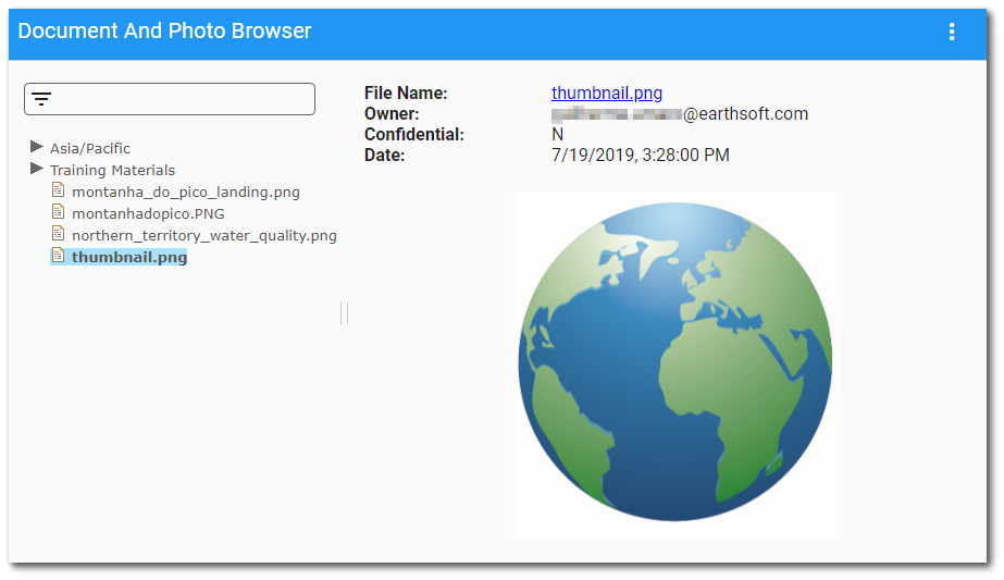
•File List Pane – This section (on the left side of widget) is used to navigate to different folders and files. The folder to the far left will be the root folder (usually "All Items" in the Explorer Widget). The widget will show all the files in this folder. Select a file in the pane to view the metadata associated with the file. The selected file will be highlighted in the pane.
The File List pane can be resized by dragging the || icon with the mouse. Users can set the pane width within the Widget Editor.
•Filter Bar – The filter bar at the top of the File List pane can be used to filter documents by title. Enter a search term (one or more characters) and the display of documents will be limited to the search string.
•Details Pane – This section (on the right side of widget) displays the metadata associated with the selected file and an image preview based on file type. These metadata include: File Name, Owner, Confidential, Facility (in the format <facility code>: <facility name>), Location, Date, Remark and File (this file name is also a download link). Any other metadata fields defined in the RT_FILE_PARAM_TYPE or the DT_FILE_PARAMETER tables will also be displayed. A preview image of the file will be displayed, depending on the type of file. If it is an image file, a preview version of that image will be displayed. If it is a known type of document, including PDF files, a preview image of the first page of that document will be displayed. If it is a zip file, the first level of files in that zip file will be listed in the preview image. If it is an unknown type of file, the file name will be listed in the preview image.
Note: PDF file extensions (.pdf) in DT_FILE.FILE_TYPE must be in lowercase letters for the file to display in the Document and Photo Browser widget. |
|---|
Widget Properties
To change properties of the Document and Photo Browser widget, open the Widget Editor by selecting the More Options  icon in the upper right corner of the widget to display the drop-down menu and then select the Edit menu option.
Widget Title – By default, the widget title is Document and Photo Browser. The title can be modified.
Widget Description – The description field provides a caption of the widget content for screen readers. This field improves accessibility by allowing visual elements such as charts to be given accessible text descriptions. It also displays a tooltip when hovering on the widget header. Default text (of the widget type's description) is provided but can be edited by users for additional context. This field has a 250-character limit.
Widget Color – The color of the widget can be changed using the Widget Theme icon to the left of the widget title.
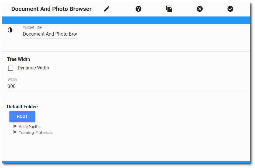
Tree Width – This property allows users to set the width (in pixels) of the folder tree view in the File List pane. If the Dynamic Width box is checked, then the set width of the File List pane automatically updates when the user adjusts the pane width on the widget. The set width will persist upon refreshes or navigation.
Root Folder Name – This property is only available to administrators. Use the drop-down tree structure to select the root folder that the Document and Photo Browser Widget should open to when first adding or refreshing and has a default root folder whose name defaults to All Items. If any folder has any sub-folders, it will be followed by an arrow icon. Clicking on this icon will display a drop-down list of the sub-folders. Clicking on any of these sub-folders in the drop-down list will add that folder to the breadcrumbs path. In this way, a user can navigate to any folder. Clicking on any previous folders in the breadcrumbs path will navigate back to that folder and set the root folder accordingly.
Widget Object Editor – To set various appearance properties of the widget, select the Object Editor  icon in the widget header to open the Widget Object Editor. See the Widget Editor article for more details.
Help – The Help  icon connects to the online documentation related to the specific widget.
Copy Settings – Select the Copy Settings  icon to to copy the settings from another widget of the same type. See the Copy Widget Settings article for more information.
Cancel – Select the Close without Saving  icon to exit the Widget Editor without saving changes.
Save – Changes will be applied to the widget by clicking on the Save  icon. The Widget Editor screen will close after the save operation is complete.