The Trend chart feature in Professional generates a time series chart of either actual data or averaged data, its polynomial trend, and a regression analysis chart. For example, it can generate time-series charts from SAMPLE_DATE/REPORT_RESULT_VALUE results of an Analytical Results II report, MEASUREMENT_DATE/EXACT_ELEV results of a Water Level report, or date/value of any Crosstab results.
Trend Chart Form
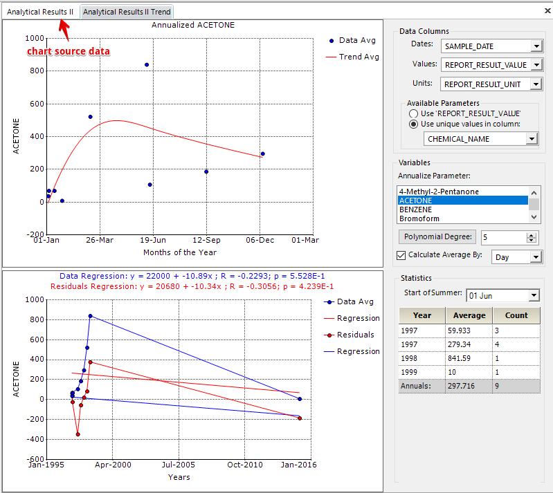
The Trend Chart form consists of two input parameter areas (Data Columns and Variables areas), two chart areas, and one statistics results area.
Data Columns
Dates – Defines a field of date-type from the source data as X-axis (not immediately updating charts).
Values – Defines a field of double-type from the source data as Y-axis of (not immediately updating charts).
Units – Defines the unit of Y-axis and is temporarily not used.
Use 'REPORT_RESULT_VALUE' (or ' .. ' determined from source data) of Available Parameters of Data Columns – Defines that chart data come from all the source data of all analytes associated to the X- and Y-axes.
Use unique values in column of Available Parameters of Data Columns – Defines that chart data come from the source data of a selected analyte associated to the X- and Y-axes.
Variables
Annualize Parameter – Defines an analyte when the "Use unique values in column" option is checked.
Polynomial Degree – Clicking it generates the best-fit polynomial trend line.
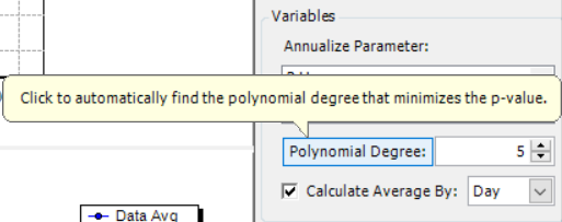
Integer box (on right side of Polynomial Degree) – Defines the polynomial degree.
Calculate Average By – Checking the box generates a time series scatter trend chart based on averaged data; otherwise, it is based on actual data if it is unchecked.
Day/Week/Month drop-down list (on right side of Calculate Average By) – Defines if the source data of the charts are averaged by day, week or month when the "Calculate Average By" option is checked.
Statistics
Start of Summer – Defines the start date of a year for calculating yearly averages of the chart source data and updates its below statistic (Year/Average/Count) table.
Year/Average/Count Table – Displays the statistic results of the chart source data.
A Scatter Chart with Polynomial Trend Line (top chart of two chart areas)
The year factor of the scatter chart of either actual or averaged data has been ignored when chart data are prepared, as if all the data of different years occur in the same year (Trend form arbitrarily uses Year 2000). That is why Year is not displayed in the X-axis of the scatter trend chart.
If the "Calculate Average By" checkbox is checked, the source data of the scatter chart are first averaged by the selection of Day/Week/Month drop-down list and then various years of X-axis date values are replaced with 2000.
A Scatter-line Chart with Linear Regression Lines (bottom chart of two chart areas)
The Data (or Data Avg) scatter-line chart series is generated from either actual or averaged data and its linear regression line (red Regression) is also plotted and the regression equation is displayed with blue color.
The Residuals scatter-line chart series is generated from the differences between either actual or averaged data and the polynomial trend line, and its linear regression line (blue Regression) is also plotted, and the Residuals regression equation is displayed with red color.
Create and Modify Charts
First, run a report (e.g., Analytical Results II) to prepare the source data of Trend charts, and then click the Trend Chart ![]() button to open the Trend Chart form.
button to open the Trend Chart form.
Trend charts may be created as in the following example (as displayed in the Trend Chart Form image above):
1.When logged into EQuIS Professional, click the Reports button (for this example, test Springfield database is being used; other locations, matrices, and analytes may be substituted based on the contents of the database).
2.Select the Analytical Results II Report, and click Open.
3.Input parameter selections can be made at each node. For this example, choose Location/Individual(s) = B-30, Result/Analyte/Group(s) = VOCS. Leave all other values as default (no selection).
4.Run the report by clicking the Go ![]() button. Results will be returned in grid format.
button. Results will be returned in grid format.
5.To open an Trend chart form, click the Trend Chart ![]() button in the grid toolbar.
button in the grid toolbar.
6.To create the charts with the averages of ACETONE and its trends, select ACETONE in Annualize Parameters.
Add Annotation to a Chart
1.Right-click the point in the chart area where you want to insert an annotation to open a menu window. Select Add ... > Annotation, and the Trend form adds an annotation with a default name.
2.Right-click the added annotation to open its properties editor, modify the value of Text to a desired string (e.g., My annotation), and press the Enter key to review the change in the chart. XValue/YValue can be edited to adjust the location of the annotation. If editing is finished, click OK in the editor.
Tip: If some additions seem to not be working, try to increase or decrease XValue or YValue by 1 and press the Enter key. For example, extend Font, modify Bold to True and the font of the annotation may not be applied at this point. Increase XValue by 1 and press the Enter key, and the font of the annotation is changed to bold. |
Add Image to a Chart
1.Right-click the point in the chart area where you want to insert an image to open a window. Select Add ... > Image, and then select an image from a folder to add the chart.
2.Right-click the added image to open its properties editor, extend Symbol, and change Size to the desired values. Note the changed size is not immediately reflected on the chart. Slightly increase or decrease XValue or YValue, press the Enter key, and the image with modified size is updated in the chart. If editing is finished, click OK in the editor to close the editor.
Edit A Chart
Right-click anywhere in a chart area to open a menu window. Select 'Selected chart' Properties to open the chart editor.
Example 1 – Make the Title Bold
Right-click anywhere of the top chart area, click (Collection) of Titles to open ChartTitle Collection Editor, extend Font and modify the value of Bold to True in ChartTitle Collection Editor.
Example 2 – Add a Title to the Top Chart
Right-click anywhere of the top chart area, click (Collection) of Titles to open ChartTitle Collection Editor, click Add in ChartTitle Collection Editor, select the added title, and enter a title to the value of Text.
Edit A Chart Series
Right-click an item of the chart legend to open the Chart Series Style editor of the selected series legend (e.g., click Symbol of the editor and change Shape to Diamond, etc.).
Edit the Polynomial Trend Line
Right-click the Trend item of the chart legend to open the 'Trend' Properties editor (e.g., click Color of the editor and change it to red, etc.).
Edit X/Y Axis
Axis features such as formatting, offset, title, and scaling can be edited by:
1.double-clicking on the chart and navigating to the "Axes" tab, then selecting the correct axis, or
2.right-clicking on the axis and choosing "Properties".
The Axis > Labels > Style > Round First feature within Option 1 may have to be unchecked for certain scales.
Save a Chart
Right-click anywhere in the chart area to open a menu window, select Save As... > Image, and select a folder or change an image type if needed to save the chart to the computer. Available file types consist of:
•JPEG/JFIF (*.jpg, *.jpeg)
•CompuServe Graphics Interchange (*.gif)
•Portable Network Graphics (*.png)
•Tagged Image File Format (*.tif, *.tiff)
•Windows Bitmap (*.bmp)
•Windows Metafile (*.wmf)
•Scalable Vector Graphics (*.svg)
•Vector Markup Language (*.vml)
A chart may also be exported as a PDF file by double-clicking within the chart area and clicking on the "Export" option that appears.
Copy a Chart
1.Right-click anywhere within a chart area to open a menu window.
2.Hover over the Copy As... option.
3.Select the file type to copy to the computer clipboard:
oBitmap (.bmp)
oPortable Network Graphic (.png), or
oTagged Image Format (.tif)
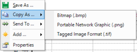
Note: Only the selected chart pane (Annualized or Regression) will be copied. |
A chart may also be copied by double-clicking within the chart area and clicking on the "Export" option that appears.
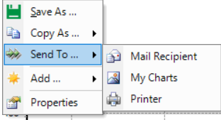
Email/Save/Print a Chart
1.Right-click anywhere within a chart area to open a menu window.
2.Hover over the Send To... option.
3.Select the destination to send to:
oMail Recipient
oMy Charts – Will create a new folder named by date and time in ...\My EQuIS Work\Charts\... with a *.jpg of the selected chart, named by statistics (e.g., "Data Regression_ y = -1044000 + 522.9x ; R = 0.9306; p = 2.350E-3.jpg" or "Annualized ACETONE.jpg").
oPrinter – Same as above but opens the image in a photo editor / printer window for printing.
A chart may also be printed directly from EQuIS Professional by double-clicking within the chart area and clicking on the "Print" option that appears.
Use Chart Editor
Double-click anywhere on a chart area to open the Chart Editor.