The purpose of the EQuIS Live - Live Chart widget is to show a live stream of all new data. The widget provides automatic updates with new data, based on the frequency of the selected series. The image below is an example of the Live Chart widget to illustrate how to use the chart. A dashboard may have multiple Live Chart widgets, each with its own collection of series.
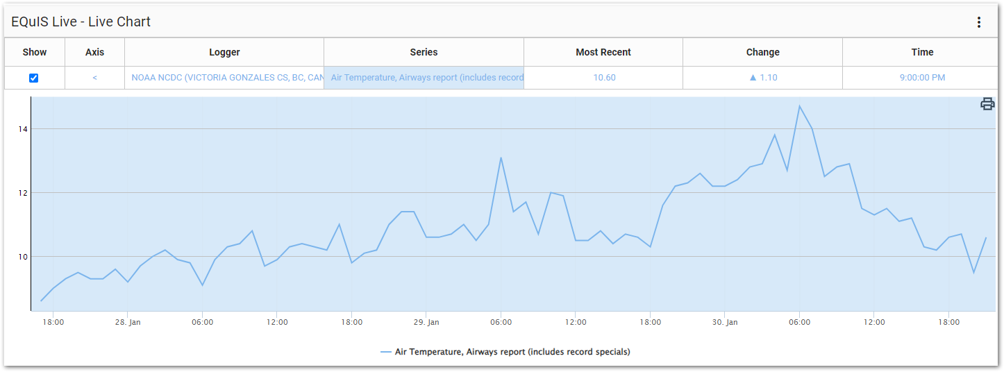
The widget contains two parts: a legend and a chart.
Legend
The legend displays information about the plotted series and allows the user to show or hide the series on the chart. The name of each series and logger source are denoted. Toggle the Show check box for each series to show or hide that series on the chart.
Click the series name in the legend to show or hide the typical range for the given series (the "plot band"). This range is defined in DT_LOGGER_SERIES.TYPICAL_MIN_VALUE and DT_LOGGER_SERIES.TYPICAL_MAX_VALUE, but can also be set manually for each series in the Widget Editor.
The Most Recent data value is displayed to the right of the series name in the legend. A triangle icon in the Change column indicates if the most recent value represents an increase or decrease when compared to the previous value.
The Time column displays the time for the most recent value (based on the standard time zone of the data logger). Hover the cursor over this time to see the full date and time as well as the transmit period for the series.
Note: Any series with longer description values may not get the full value displayed in the widget legend or the legend of an exported chart. |
|---|
Chart
The chart portion of the widget displays the logger data as time series graph(s). Plot line(s) can also be added to the chart.
Tooltip
The user can hover over individual data points in the data series to see values. Hovering the mouse over the chart will display a tooltip. The top line of the tooltip contains the date/time value at the current point on the time axis (i.e., X-axis). The date/time will be displayed based on the culture specified in the current browser settings. Following the date/time value, each series will be listed (assuming the series has a value for the current date/time). The series name will be followed by the value. The values will be displayed with the number format based on the culture specified in the current browser settings.
The option to print the chart, as seen in the widget, can be accomplished by clicking the Print ![]() button in the top-right corner of the chart.
button in the top-right corner of the chart.
Widget Editor
To open the Widget Editor, select the More Options ![]() icon in the upper right corner of the Live Chart widget to open the drop-down menu and then select the Edit menu option. The widget properties are divided into two tabs: Loggers and Options.
icon in the upper right corner of the Live Chart widget to open the drop-down menu and then select the Edit menu option. The widget properties are divided into two tabs: Loggers and Options.
Widget Title – By default, the widget title is EQuIS Live - Live Chart. The title can be modified.
Widget Color – The color of the widget can be changed using the Change Widget Theme![]() icon to the left of the widget title.
icon to the left of the widget title.
Help – The Help ![]() icon connects to the online documentation related to the specific widget.
icon connects to the online documentation related to the specific widget.
Copy – Select the Copy Settings ![]() icon to copy the settings from another widget of the same type. See the Copy Widget Settings article for more information.
icon to copy the settings from another widget of the same type. See the Copy Widget Settings article for more information.
Cancel – Select the Close without Saving ![]() button to exit the Widget Editor without saving changes.
button to exit the Widget Editor without saving changes.
Save – Changes will be applied to the widget by clicking on the Save ![]() button. The Widget Editor screen will close after the save operation is complete.
button. The Widget Editor screen will close after the save operation is complete.
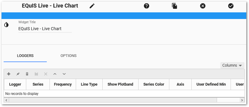
Loggers Tab
The grid at the bottom of the Loggers tab allows the user to view, ad, edit, or delete the series currently displayed in the Live Chart widget. The order of the series in the view grid is the display order for the widget legend. Use the Columns drop-down menu to determine which columns are displayed in the view grid.
Add Logger Series
To add a logger series:
1.Click the Add ![]() icon in the upper left corner of the grid to open the Add Series window.
icon in the upper left corner of the grid to open the Add Series window.
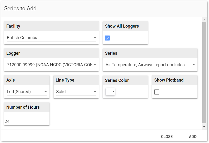
2.Select an EQuIS Facility (or select No Facility).
3.Select a Logger. If Show All Loggers is unchecked, only loggers that have a set transmit interval will display (where DT_LOGGER.TRANSMIT_PERIOD_S is populated).
4.Select a Series within the logger.
5.Select which Axis this series should use. Series using the "Shared" axis will all reference the same axis. Adding multiple series with "Own" axes will result in several left or right axes plotted on the chart. These series will be color-coded and marked in the chart legend to match the series to which it belongs. If the Axis is left(Own) or right(Own), users may choose to Invert it.
6.Choose a Line Type.
7.Select a Series Color for the series on the chart.
8.Select whether or not to Show Plotband (highlighted region between the minimum and maximum set for each series) for this series.
9.Enter the Number of Hours previous to the current time from which to display data.
10.Click Add.
11.Click Close when all selections are completed.
12.The series will appear in the view grid at the bottom of the Loggers tab window.
Edit Logger Series
Each logger series can be edited from the view grid. To edit a series, select the series in the view grid and then click the Edit ![]() icon on the toolbar of the view grid frame. Change properties for the series as desired. Click the Save
icon on the toolbar of the view grid frame. Change properties for the series as desired. Click the Save ![]() icon on the toolbar to save changes. Otherwise, click the Cancel
icon on the toolbar to save changes. Otherwise, click the Cancel ![]() icon on the toolbar to return to the series list.
icon on the toolbar to return to the series list.
To reorder series within the chart's legend, select a logger series in the view grid and then use the Up and Down icons on the toolbar of the view grid frame.
To delete a logger series, select the series in the view grid and then click the Delete ![]() icon on the toolbar of the view grid frame.
icon on the toolbar of the view grid frame.
Options Tab
The following parameters for the chart can be set on the Options tab:
•Show/hide the Legend.
•Set Chart Height.
•Show X-axis Label – Especially helpful to show what time zone is chosen using the Time Zone options described below.
•Show Y-Axis Labels (Own) – When series are plotted with distinct (or "own") Y-axes, displays labels by each axis. The series name becomes the label.
•Add labels to left and/or right Y axes.
•Show Data Points graphically on the chart.
•Add Min/Max Y Axis Lines
•Show Minor Lines (Left Axis)
•Show Tick Lines (Left Axis)
•Show Minor Lines (Right Axis)
•Show Tick Lines (Right Axis)
•Time Zone Override
•None – Displays logger's local time.
•Local – Displays user's local time.
•Custom – Displays with UTC offset entered in the adjacent box (e.g., entering "-6" will display in UTC-6:00).
•Override Heartbeat and Heartbeat Seconds – Manually set the refresh rate of the chart. If unused, the transmit period seconds from DT_LOGGER will be the refresh rate, which is displayed in Default Heartbeat Seconds.
•Max Decimal Digits – Set how many decimal places with which the data will display.
•Stack Series – The series will be stacked on each other.
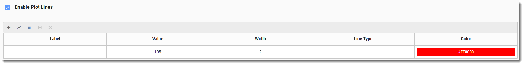
•Enable Plot Lines – Enable the display of horizontal plot lines for the chart. When enabled, a grid will appear below in which plot lines can be configured. Click the Add ![]() icon in the upper left corner of the grid to add a new plot line row. Enter desired values. Click the Save
icon in the upper left corner of the grid to add a new plot line row. Enter desired values. Click the Save ![]() icon on the toolbar to save changes. To edit a plot line, select the line in the view grid and then click the Edit
icon on the toolbar to save changes. To edit a plot line, select the line in the view grid and then click the Edit ![]() icon on the toolbar.
icon on the toolbar.
•Label – Enter optional text to display in legend.
•Value – Required field that specifies where on Y-axis the line will be plotted.
•Width – The width of the line. Defaults to 2 if not set.
•Line Type – Defines the appearance of the line. Select from Solid, Dot, or Dash. Defaults to Solid.
•Color – Use the color picker to set the color of the plot line. Defaults to red if not set.