Use the Widget Editor to add series to the chart, edit existing series, and change other options for the Live Historical Chart widget. To open the Widget Editor, select the More Options ![]() icon in the upper right corner of the widget to open the drop-down menu and then select the Edit menu option. The widget properties are divided into five tabs: Series, Axes, Options, Qualifiers, and Default Options.
icon in the upper right corner of the widget to open the drop-down menu and then select the Edit menu option. The widget properties are divided into five tabs: Series, Axes, Options, Qualifiers, and Default Options.
Widget Title – By default, the widget title is EQuIS Live - Historical Chart. The title can be modified.
Widget Color – The color of the widget can be changed using the Change Widget Theme![]() icon to the left of the widget title.
icon to the left of the widget title.
Help – The Help ![]() icon connects to the online documentation related to the specific widget.
icon connects to the online documentation related to the specific widget.
Copy – Select the Copy Settings ![]() icon to copy the settings from another widget of the same type. See the Copy Widget Settings article for more information.
icon to copy the settings from another widget of the same type. See the Copy Widget Settings article for more information.
Cancel – Select the Close without Saving ![]() button to exit the Widget Editor without saving changes.
button to exit the Widget Editor without saving changes.
Save – Changes will be applied to the widget by clicking on the Save ![]() button. The Widget Editor screen will close after the save operation is complete.
button. The Widget Editor screen will close after the save operation is complete.
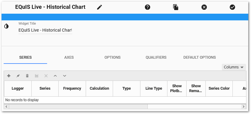
Series Tab
The grid at the bottom of the Series tab allows the user to view, add, edit, or delete the series currently displayed in the Live Historical Chart widget. The order of the series in the view grid is the display order for the widget legend. Use the Columns drop-down menu to determine which columns are displayed in the view grid.
Add Logger Series
To add a logger series:
1.Click the Add ![]() icon in the upper left corner of the grid to open the Add Series window.
icon in the upper left corner of the grid to open the Add Series window.
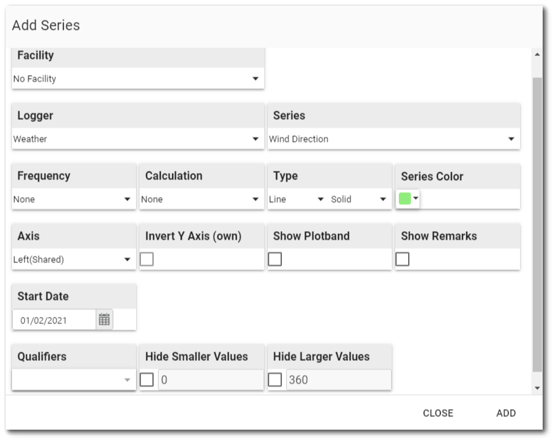
2.Select a Facility (if the intended logger belongs to a facility). Defaults to No Facility.
3.If any loggers in this facility are tied to locations, optionally select the Location from the field that appears after selecting the facility.
4.Select a Logger.
5.Select a Series within the logger.
6.Select a Frequency on which to aggregate the series' data.
a.For example, display weekly summaries of a series whose raw data have a daily frequency.
b.Select None to show raw data.
7.If an aggregating Frequency is chosen, select a Calculation method.
Note: The "None" option will aggregate data using the Average calculation of the data, EXCEPT when there are values that fall outside of the typical range set in DT_LOGGER_SERIES. If any values in the set to be aggregated fall below TYPICAL_MIN_VALUE, the series will use the Minimum calculation on that data set. If any values in the set exceed TYPICAL_MAX_VALUE, the series will use the Maximum calculation. |
|---|
8.Select a Series Type (Line, column, or candlestick).
Note: The combination of logger series type, frequency, and calculation must be unique. The widget will not permit selection of duplicate settings. |
|---|
9.Select a LineType (Solid, ShortDot, LongDash, etc.).
10.Select a Series Color for the series on the chart.
11.Select which Axis this series should use. Series using the "Shared" axis will all reference the same axis. Adding multiple series with "Own" axes will result in several left or right axes plotted on the chart. These series will be color-coded and marked in the chart legend to match the series to which it belongs. If the Axis is left(Own) or right(Own), users may choose to Invert it.
Note: A Shared axis can be inverted from the Options tab of the Widget Editor. |
|---|
12.Select whether or not the Plot Band will be shown for this series.
13.Select whether or not Remarks will be shown for this series.
14.Select a Start Date for the data (defaults to the earliest date in the series). Start Date format is ISO 8601 (YYYY-MM-DD). Enter a date or use the date picker.
15.Select which Qualifiers to make available for display in the series. Note that qualifiers can be assigned to series by using the Out-of-Range agent or by following the "To Add a Qualifier" steps below.
16.Optionally, set the Min/Max values for the series as displayed in the chart. These values are used for the series' plot band and for filtering out values if the Hide smaller values or Hide larger values options are enabled. If no minimum or maximum are set, they will be automatically populated with DT_LOGGER_SERIES.TYPICAL_MIN_VALUE and DT_LOGGER_SERIES.TYPICAL_MAX_VALUE, respectively, if they are not null.
17.Click Add.
18.Click Close when all selections are completed.
19.The series will appear in the view grid at the bottom of the Series tab window.
Edit Logger Series
Each logger series can be edited from the view grid. To edit a series, select the series in the view grid and then click the Edit ![]() icon on the toolbar of the view grid frame. Change properties for the series as desired. Click the Save
icon on the toolbar of the view grid frame. Change properties for the series as desired. Click the Save ![]() icon on the toolbar to save changes. Otherwise, click the Cancel
icon on the toolbar to save changes. Otherwise, click the Cancel ![]() icon on the toolbar to return to the series list.
icon on the toolbar to return to the series list.
To reorder series within the chart's legend, select a logger series in the view grid and then use the Up and Down icons on the toolbar of the view grid frame.
To delete a logger series, select the series in the view grid and then click the Delete ![]() icon on the toolbar of the view grid frame.
icon on the toolbar of the view grid frame.
Axes Tab
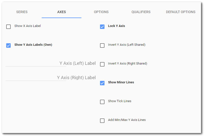
The following parameters for the chart can be set on the Axes tab:
•Show X Axis Label – Especially helpful to show what time zone is chosen using the Time Zone options.
•Show Y Axis Labels (Own) – When series are plotted with distinct (or "own") Y axes, displays labels by each axis. The series name becomes the label.
•Y Axis (Left/Right) Label – Label applied to the "shared" left or right Y axes.
•Lock/unlock Y Axis – When checked, prevents the chart from adjusting the Y Axis scale of the current view of the chart. The default setting is locked. When the Y axis is unlocked, the Y axis scale(s) changes dynamically when zooming in on data.
•Invert Y Axis (Left/Right) – Inverts the values for the "shared" left or right Y axes (values go from low on top to high on bottom).
•Add/remove major and minor tick lines.
•Add/remove Min/Max Y Axis lines.
Options Tab

The following parameters for the chart can be set on the Options tab:
•Set Chart Height.
•Show/hide the Grid Legend (above the grid), Chart Legend (below the chart), Navigator, and Scroll Bar.
•Stack Series – If column series are used, the series will be stacked on each other if this option is enabled.
•Show Data Gaps – Gaps in data series will be displayed without lines joining them.
•Highlight Data Gaps – Gaps in data series will be highlighted with a vertical shaded region.
•Show Data Points – Individual data points will be plotted.
•Max Decimal Digits – Decides how many decimal places will be used when displaying individual data points in the tooltip that appears in the main chart area.
•Time Zone Override
oNone – Displays logger's local time (DT_LOGGER_DATUM.DATUM_UTC_DT + DT_LOGGER.UTC_OFFSET_HRS).
oLocal – Displays user's local time (e.g., if user's local time zone is Central Standard Time, it will display UTC-6:00).
oCustom – Displays with UTC offset entered in the adjacent box (e.g., entering "-6" will display in UTC-6:00)).
•Fixed Start Date – Enter a number of days back that the data should be plotted. This will display all data series starting at that date, regardless of what each series start date was when added to the widget. Set "0" to turn this feature off.
Qualifiers Tab
Add qualifiers to Live data. These qualifiers can be used to highlight specific portions of data via a selected color. If a 'transparent' color is selected, then this can be used to hide sections of data, if desired (e.g., if a logger was found to be faulty for a certain period).
Add a Qualifier
1.On the Qualifiers tab, Click the Add ![]() icon on the toolbar and enter a qualifier name (up to four characters).
icon on the toolbar and enter a qualifier name (up to four characters).
2.Select a color for the qualifier. To make data 'invisible', select 'Transparent' as the color.
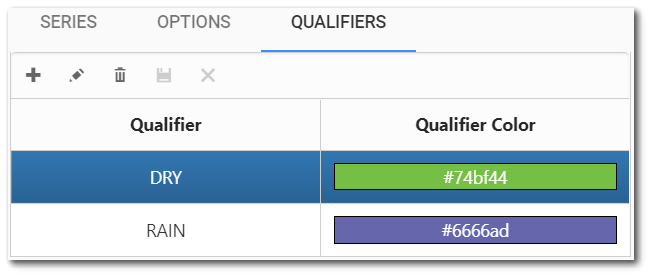
3.Click the Save ![]() icon on the toolbar.
icon on the toolbar.
4.Select the Series tab.
5.Create a new series, selecting which of the qualifiers created in Step 2 should be shown in the series. If the series already exists, select the Edit ![]() icon on the toolbar and then select the Qualifier.
icon on the toolbar and then select the Qualifier.
6.Click the Save ![]() icon on the toolbar.
icon on the toolbar.
7.Click the Save ![]() button on the Widget Editor header to close the Widget Editor and return to the chart.
button on the Widget Editor header to close the Widget Editor and return to the chart.
8.Click on the chart to zoom to an area with of the series where you want to add a qualifier.
9.Select Add Qualifier from the Chart Context Menu (![]() ) in the top-right corner of the chart.
) in the top-right corner of the chart.
10.Choose a qualifier from the drop-down menu.
11.Select OK.
12.The chart will reload with the qualifier applied. The qualifier will appear next to the series name in the widget tooltip.
Notes: •The qualifiers will also be applied to the DT_LOGGER_DATUM.DATUM_QUALIFIER field for the selected date range.
•If adding or removing remarks or qualifiers, it is recommended that only one data series be present on the widget, unless the series share the same time zone offset |
|---|
Default Options Tab
The Default Options tab defines how the widget handles color for the data series. Select the desired option from the drop-down menu.
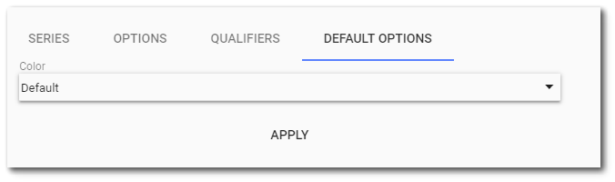
Default – By selecting Default and clicking Apply, each series (up to 10) that has been added to the chart will get a preset color (by position). Any additional series will be given the color white. Changing the order of series (including deleting a series) WILL NOT affect the colors already set.
Position – By selecting Position and clicking Apply, the widget will populate colors according to positions defined in the ST_CONFIG table. If there is no value found for that position or the value is invalid, a default color will be assigned. Changing the order of series (including deleting a series) WILL affect the colors already set.
Note: Any series that has the color white will be assigned a temporary color for displaying the chart, but will remain white in the Widget Editor. |
|---|