Warning: Do not make modifications to the standard dashboards. These will be overwritten during upgrades. The standard dashboards can be copied first, then the copies can be modified. |
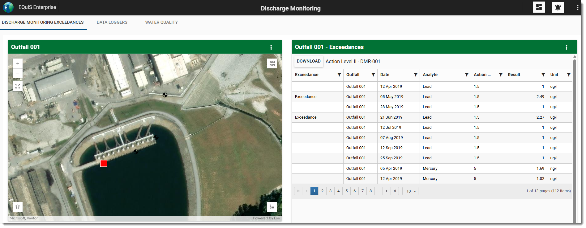
This article describes how to use the Dashboard Editor to set the properties and layout of the dashboard and to add widgets to the dashboard. Watch the "Dashboard Configuration in EQuIS Enterprise" Office Hour recording to see a live demonstration. The image below is an example of a dashboard using horizontal tabs.
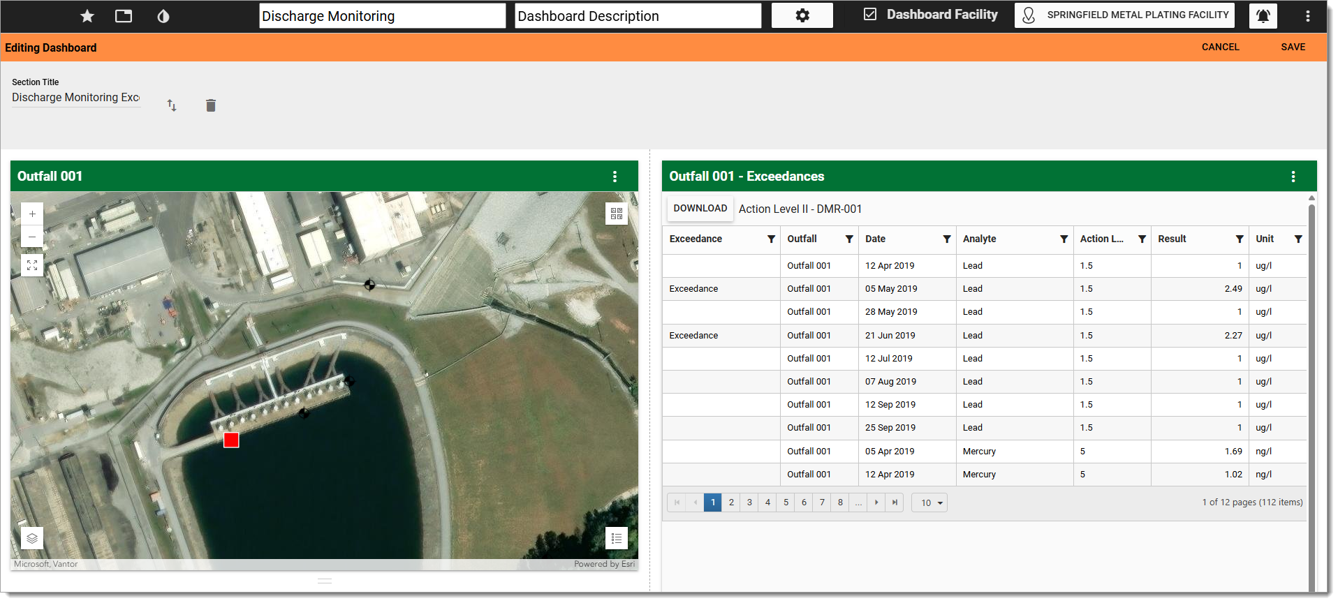
Select the More Options  icon on the right-side of the dashboard header to open a drop-down menu. Select Edit from the drop-down menu to view the Dashboard Editor and view/modify properties of the current dashboard. The Edit menu is only visible if the user has owner permission for the current dashboard.
The Dashboard Editor will open.
Editing the Header
The top part of the Dashboard Editor shows the dashboard header. Within the header, the following properties can be set:
•Title – Current title is displayed by default. Edit the title of the dashboard by typing directly into the title text box in the header. The dashboard title is restricted to 250 characters.
•Description – Current description is displayed (if one has been added). Edit the description of the dashboard by typing directly into the description text box (to the right of the title text box).
•Color – The default dashboard color theme is white. Change the background color of the dashboard header by selecting the Dashboard Theme icon and then choosing one of the colors from the drop-down menu. Available colors are white, red, green, blue, purple, and black. Note, setting the dashboard color theme will update the color of all widgets regardless of their theme. Use the widget editor to update the individual widget's color theme.
•Toggle Tabs – The display of dashboard sections can be either in a stacked vertical alignment or as horizontal tabs. The Toggle Tabs  icon enables/disables the use of horizontal tabs for each dashboard section. By default, horizontal tabs are disabled (
 ).
).
•Toggle Favorite – The Toggle Favorite  icon indicates whether or not the current dashboard is one of the user's favorites. Clicking the star will toggle a favorite. A gold star indicates the dashboard is a favorite dashboard and will be displayed in the Favorites section in the dashboard chooser.
•Session Facility Chooser – Displays the selected session facility name (  ), or facility group name (
 ). Select to open the Facility Chooser, where the user can choose a different facility or facility group for the session.
•Dashboard Facility – The dashboard can be set to have a default facility or facility group. To set the dashboard facility, first select the facility and then check the Dashboard Facility check box on the dashboard header. When the facility is set for the dashboard, the session facility chooser and facility name will no longer be displayed and permissions for this dashboard will be checked against permissions for the selected facility. To make a dashboard permanently facility agnostic (i.e., no facility), clear the session facility and then select the Dashboard Facility check box.
•Advanced Dashboard Editor – Selecting the Advanced Dashboard Editor  icon will open the JavaScript Object Notation (JSON) editing window. Dashboard properties can be manually edited in the window.
•Cancel – Select the Cancel button to exit the Dashboard Editor without saving changes.
•Save – Changes will be applied to the dashboard by clicking on the Save button. The Dashboard Editor will close after the save operation is complete.
Editing the Layout
Below the dashboard header, the layout of the current dashboard is displayed. Each section (or row) of the dashboard is denoted by its title (may be blank) and contains columns (at least one) and widgets. Each dashboard can contain numerous sections, but may become difficult to navigate if too many sections or widgets are added.
Edit the dashboard layout as described below. Remember to Save the Dashboard to keep any changes to the layout.
Editing Sections
Add Section Title
Edit the section title by typing directly into the title text box. The section title is restricted to 250 characters. If no title is entered, the section header will not be displayed on the dashboard.
Add Section
Add a new section at the bottom of the dashboard or between existing sections by clicking the Add Section button that appears at the bottom of each section in the layout. After clicking the Add Section button, a new section with a single column is created. More columns can be added to the new section. The height of the section is controlled by the maximum height of the widgets within the section.
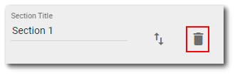
Delete Section
Delete a section from the dashboard by clicking the Delete icon that appears within the Section Title block. Deleting a section will delete all widgets and columns contained within that section. The user will be prompted with a confirmatory message prior to deletion.
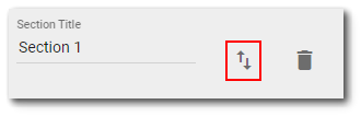
Reorder Sections
Reorder sections on the dashboard by clicking the Reorder icon that appears within the Section Title block.
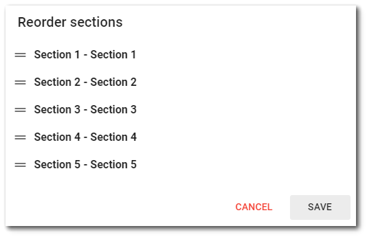
Clicking on the icon will open a dialog containing a list with each section on the dashboard as a draggable item. Reordering the list in the dialog will reorder the sections live behind the open dialog. Saving the dialog and saving the dashboard edit will save the new order of the sections for the dashboard. Cancelling either the dialog or the dashboard edit will revert the reordering of the sections.
Editing Columns
Add Columns
You may add a new column within a section by clicking the Add New Column  icon at the bottom-right side of an existing column. The new column will be added to the right of the existing column. The width of the existing column (and widgets contained within) will automatically be adjusted.
Adjust Column Width
To adjust the width of an existing column (and widgets contained within), hover the mouse over the vertical bars ( ) on the right-side of the column. When the mouse pointer changes to left and right arrows, move the mouse to increase or decrease the column width as desired.
Remove Column
Remove a column within a section by clicking the Remove Column  icon that appears at the bottom-right corner of each column within the section. Once a column is removed, the width of the remaining columns adjusts automatically. Deleting a column will delete all widgets contained within that column.
Warning: Selecting the Remove Column button removes the column without a confirmatory warning prompt. If a column is accidentally removed during the editing process, select the cancel button to not keep the changes. |
Editing Widgets
Add Widget
Select the plus icon  to add a widget in the desired location on the dashboard. Clicking the button will open the Widget Chooser. Once the Widget Chooser opens, select the desired widget. The widget will be displayed on the dashboard in the desired location. The horizontal extent of the widget is dictated by the column width. The height of the widget can be adjusted by dragging the horizontal bars (
 ) beneath the widget. Hover the mouse over the horizontal bars and when the mouse pointer changes to up and down arrows (
 ), move the mouse to increase or decrease the height of the widget. Widgets can be moved by clicking on the widget header and dragging the widget to a new section of the dashboard.
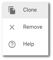
Clone or Remove Widget
To clone (i.e., copy) or remove a widget from the dashboard, select the More Options icon from the widget header to open a drop-down menu with the following options:
Clone – Selecting the Clone menu option copies the widget and adds the copy to the dashboard directly above the existing widget. This option is extremely helpful to duplicate already configured widgets. Remove – Selecting the Remove menu option deletes the widget. The user will be prompted with a confirmatory message prior to deletion. Selecting the Cancel button will not delete the widget. Selecting the Yes button will remove the widget from the dashboard. Help – Selecting the Help menu option opens the Enterprise documentation in a new tab. |
|