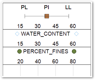
The Multi-Data Chart is used to chart multiple fields from a compatible EQuIS user report (see EnviroInsite Boring Log Template Designer Reports Tab for more information). Multiple single data plot charts and range data plot charts can be plotted together. The Multi-Data Chart can be added to a Boring Log template after running a user report.
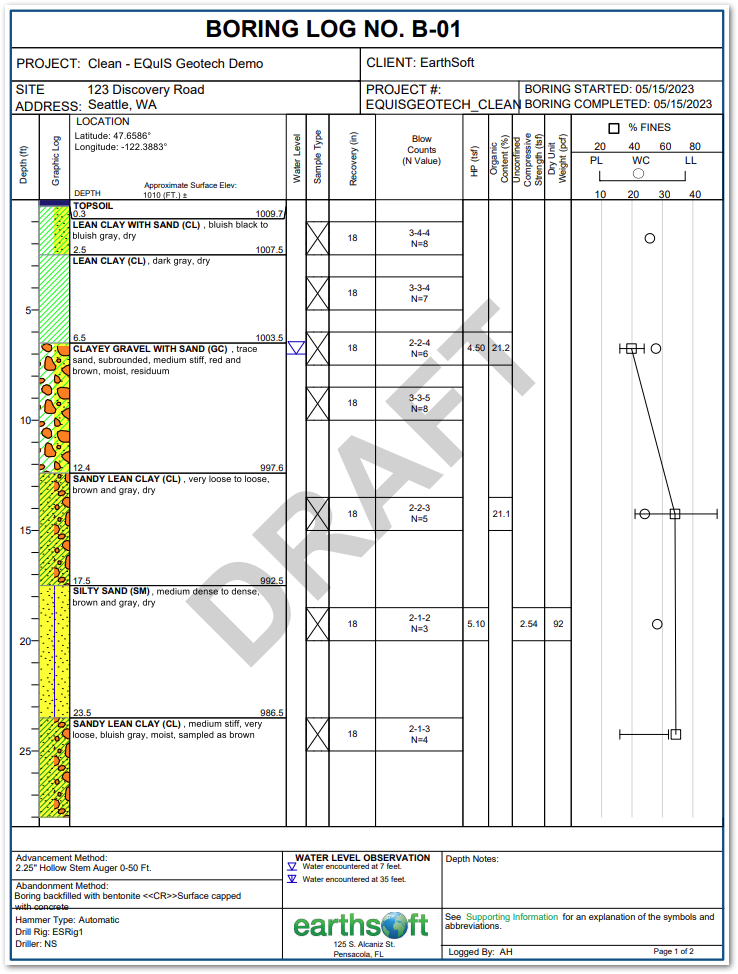
Options Tab
Show Grid – Check to draw grid lines.
Auto Generate Header – Check to automatically generate a header for the Multi-Data Chart.
Plot Outline – Check to draw outline.
Location X and Y – Enter location of plot on the page in inches.
Width – Enter plot width.
Text Height – Enter text height used when posting values.
Text Style – Select text style when posting values.
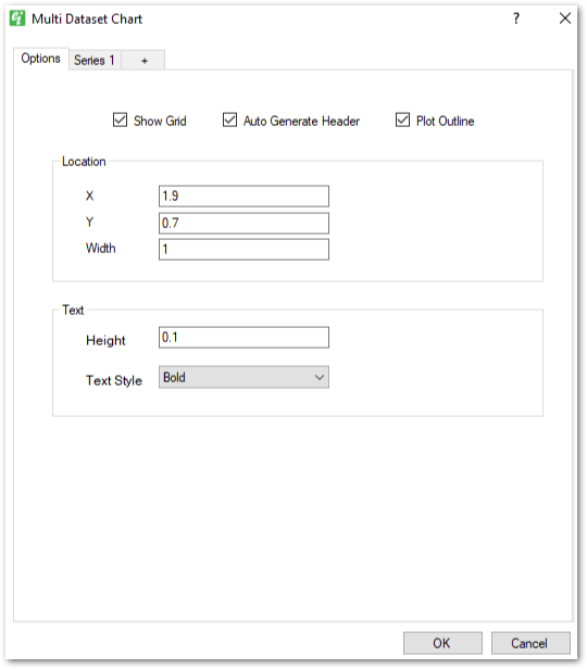
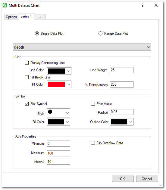
Series Tabs
Each series tab represents a series in the chart. Use the radio buttons to switch between the Single Data Plot and Range Data Plot options.
Single Data Plot
Data Source – Select the report field from the drop down list to plot.
Line –
•Display Connecting Line – Check to plot a line connecting multiple points on the chart.
•Line Color – Select the color of the connecting line.
•Line Weight – Enter the weight of the connecting line.
•Fill Below Line – Check to plot a solid fill below the chart line.
•Fill Color – Select the color of the solid fill.
•Transparency – Enter the fill transparency between 0 and 255.
Symbol –
•Plot Symbol – Check to plot a symbol at each point.
•Post Value – Check to plot the point value as text above each point.
•Style – Select the symbol style to plot.
•Radius – Enter the radius for the plotted symbol.
•Fill Color – Select the fill color for the plotted symbol, select transparent to plot hollow symbols. Fill color does not apply to some symbols.
•Outline Color – Select the symbol outline color.
Axis Properties –
•Minimum – Enter the minimum value for the chart axis.
•Maximum – Enter the maximum value for the chart axis.
•Interval – Enter the tick interval for the chart axis. The interval only applies to the first series. The interval will be calculated for additional series.
•Clip Overflow Data – Check to clip the data between the minimum and maximum. The point values will be plotted inside the minimum and maximum to show the data overflows.
Range Data Plot
Left Data Source – Select the report field from the drop down list to plot as the left edge of the range plot.
Center Data Source (optional) – Select the report field from the drop down list to plot as the center of the range plot.
Right Data Source – Select the report field from the drop down list to plot as the right edge of the range plot.
Symbol –
•Plot Symbol – Check to plot a symbol at each point.
•Post Value – Check to plot the point value as text above each point.
•Style – Select the symbol style to plot.
•Radius – Enter the radius for the plotted symbol.
•Fill Color – Select the fill color for the plotted symbol, select transparent to plot hollow symbols. Fill color does not apply to some symbols.
•Outline Color – Select the symbol outline color.
Axis Properties –
•Minimum – Enter the minimum value for the chart axis.
•Maximum – Enter the maximum value for the chart axis.
•Interval – Enter the tick interval for the chart axis. The interval only applies to the first series. The interval will be calculated for additional series.
•Clip Overflow Data – Check to clip the data between the minimum and maximum. The point values will be plotted inside the minimum and maximum to show the data overflows.
New Series Tab (+)
Click the new series tab to add a new series to the chart. Series can be removed from the chart by selecting the series tab and right-clicking the tab.
Automatically Generated Header
The Multi-Data Chart segment can be configured to automatically generate a header section for each selected series. To generate the header section automatically, check Auto Generate Header in the Options tab. If the Auto Generate Header option is not selected, only the Title Block will plot on the Boring Log. The Title Text shown in the designer will not plot on the Boring Log.