XY Charts can generate a chart of pie type against the results of a report (e.g., Analytical Results II report) with a date type column (e.g., SAMPLE_DATE of ARII Report) being as the X-axis. It calculates the results first and then plots the calculated statistics, which is explained in the Springfield facility example below. The XY Chart does not perform unit conversion; if output includes mixed units, the results are combined.
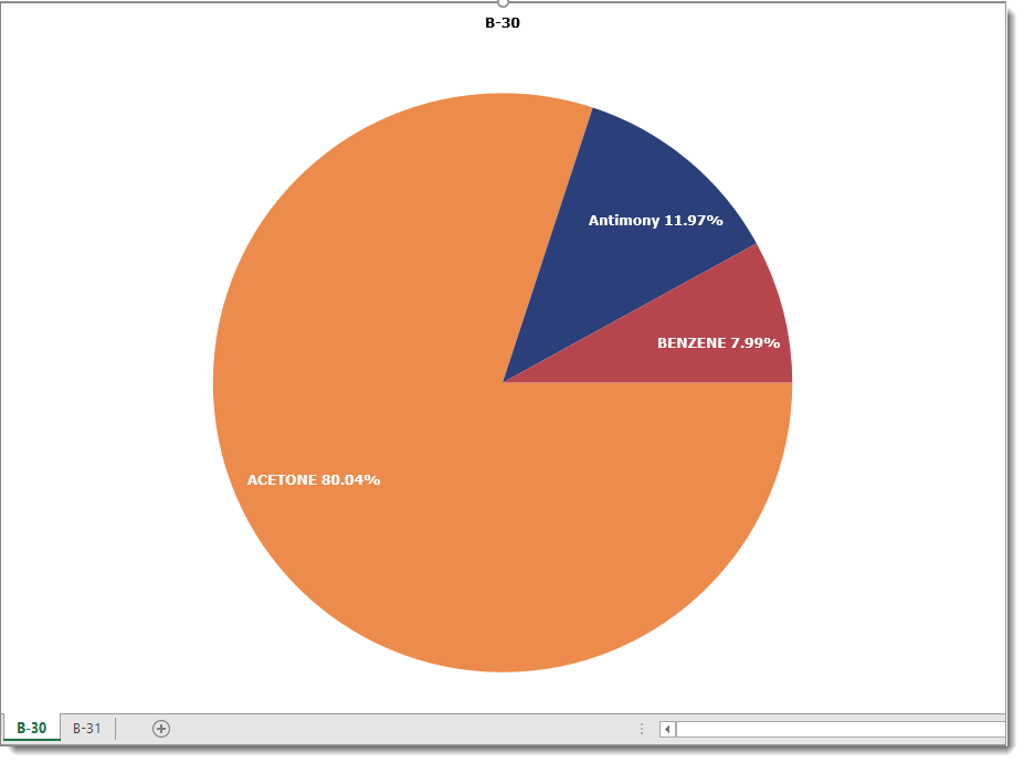
1.Run the ARII report with Acetone, Antimony, and Benzene (or other analytes) at the B-30 and B-31 locations and start XY Chart.
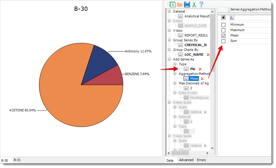
2.Select Group Series By = CHEMICAL_NAME, Group Charts By = LOC_NAME, Add Series As = Pie, and then click on Add Series to create charts. Under this scenario, XY Chart selects Add Series As > AggregationMethod as Mean by default. It calculates the averages of REPORT_RESULT_VALUE of each chemical of a location and then plots the pie chart of the averages while displaying the percentages of each average out of the total REPORT_RESULT_VALUE of all the chemicals of a location.
Note: When a pie chart is exported to Excel, labeling data points or slices of the chart is different. Instead of displaying the labels with extending lines outside of the pie, the Excel chart displays the labels within each slice area (see image below). |