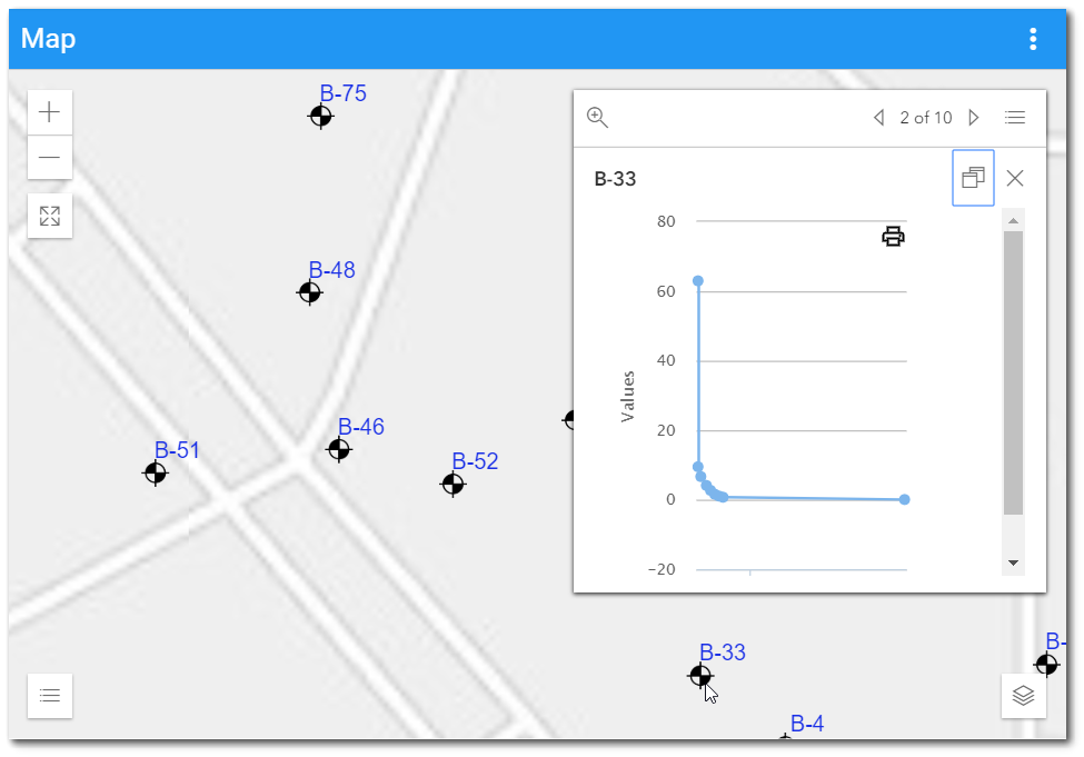
A Time Series Chart can be added to a Map widget to display when a location is selected on the map. This article outlines the steps to use this feature.
1.Create the Map widget on a dashboard and add a user report layer.
2.Select the user report and change settings/parameters as desired. Under the Popup Template drop-down menu, select the Time Series Chart option.
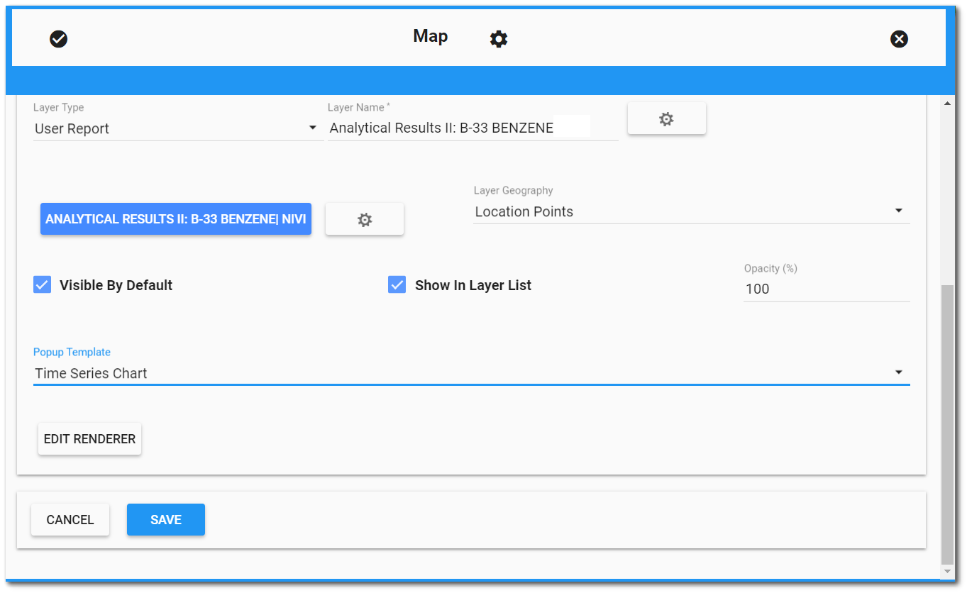
3.Configure the rest of the settings for the report layer and click Save to add the layer to the map. When the map is plotted and the new layer is active, the Time Series Chart can be displayed by clicking on any location included in the report. The values being displayed in the Time Series Chart are from the REPORT_RESULT_VALUE field in the report output.
Print Chart
The option to print the chart, as seen in the widget, can be accomplished by clicking the Print ![]() button in the top-right corner of the chart.
button in the top-right corner of the chart.